import numpy as np
import pandas as pd
import matplotlib.pyplot as plt
import seaborn as sns
import plotly.express as pxPertemuan 6 : Interactive Data Visualization (plotly)
Interactive Data Visualization using Plotly
Kembali ke EDA
plotly.express
Jika belum terinstall pada jupyter notebook anda, jalankan pip install plotly pada terminal.
Basic Charts
Line Chart
# using the iris dataset
df = px.data.iris()

# plotting the line chart
fig = px.line(df, y="sepal_width")

# showing the plot
fig.show()
Apa bedanya dengan line plot biasa?
import matplotlib.pyplot as plt
import seaborn as sns

# plotting the line chart
sns.lineplot(df, y="sepal_width", x=df.index)

# showing the plot
plt.show()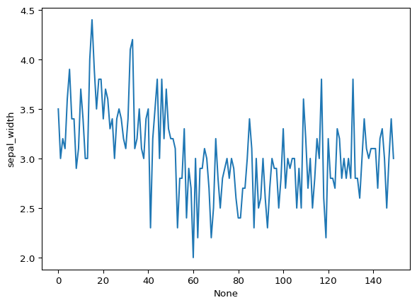
Grouping
# plotting the line chart
fig = px.line(df, y="sepal_width", line_group='species')

# showing the plot
fig.show()
# plotting the line chart
fig = px.line(df, y="sepal_width", line_dash='species',
color='species')
# showing the plot
fig.show()Bar Chart
# Loading the data
df = px.data.tips()

# Creating the bar chart
fig = px.bar(df, x='day', y="total_bill")

fig.show()
Grouping
# Creating the bar chart
fig = px.bar(df, x='day', y="total_bill", color='sex',
             facet_row='time', facet_col='sex')

fig.show()
Scatter Plot
# plotting the scatter chart
fig = px.scatter(df, x='total_bill', y="tip")

# showing the plot
fig.show()
Grouping
# plotting the scatter chart
fig = px.scatter(df, x='total_bill', y="tip", color='time',
                 symbol='sex', size='size', facet_row='day',
                 facet_col='time')

# showing the plot
fig.show()
Histogram
# plotting the histogram
fig = px.histogram(df, x="total_bill")

# showing the plot
fig.show()
Grouping
# plotting the histogram
fig = px.histogram(df, x="total_bill", color='sex',
                   nbins=50, histnorm='percent',
                   barmode='overlay')

# showing the plot
fig.show()
Pie Chart
# plotting the pie chart
fig = px.pie(df, values="total_bill", names="day")

# showing the plot
fig.show()
Donut Chart
# plotting the donut chart
fig = px.pie(df, values="total_bill", names="day",
             color_discrete_sequence=px.colors.sequential.RdBu,
             opacity=0.7, hole=0.5)

# showing the plot
fig.show()
Box Plot
# plotting the boxplot
fig = px.box(df, x="day", y="tip")

# showing the plot
fig.show()
Grouping
# plotting the boxplot
fig = px.box(df, x="day", y="tip", color='sex',
             facet_row='time', boxmode='group',
             notched=True)

# showing the plot
fig.show()
Violin Plot
# plotting the violin plot
fig = px.violin(df, x="day", y="tip")

# showing the plot
fig.show()
Grouping
# plotting the violin plot
fig = px.violin(df, x="day", y="tip", color='sex',
                facet_row='time', box=True)

# showing the plot
fig.show()
3D Plot
# plotting the figure
fig = px.scatter_3d(df, x="total_bill", y="sex", z="tip")

fig.show()
Grouping
# plotting the figure
fig = px.scatter_3d(df, x="total_bill", y="sex", z="tip", color='day',
                    size='total_bill', symbol='time')

fig.show()
Adding interaction
Untuk memunculkan tombol-tombol interaktif pada plot, kita menggunakan submodule dari library plotly yaitu plotly.graph_objects
Sliders and Selectors
x = df['total_bill']
y = df['tip']

plot = go.Figure(data=[go.Scatter(
    x=x,
    y=y,
    mode='markers',)
])

plot.update_layout(
    xaxis=dict(
        rangeselector=dict(
            buttons=list([
                dict(count=1,
                    step="day",
                    stepmode="backward"),
            ])
        ),
        rangeslider=dict(
            visible=True
        ),
    )
)

plot.show()
Lebih lanjut silakan buka dokumentasi library plotly pada link berikut : Dokumentasi Plotly
Untuk memperbaiki dan meningkatkan kualitas praktikum kedepannya, silakan berikan feedback anda melalui link berikut : Feedback Praktikum EDA 2023/2024