import numpy as np
import pandas as pd
import matplotlib.pyplot as plt
import seaborn as sns
import plotly.express as pxPertemuan 6 : Interactive Data Visualization (plotly)
Interactive Data Visualization using Plotly
Kembali ke Arsip Praktikum EVDA 2025
plotly.express
Jika belum terinstall pada jupyter notebook anda, jalankan pip install plotly pada terminal.
Basic Charts
Line Chart
# using the iris dataset
df = px.data.iris()

# plotting the line chart
fig = px.line(df, y="sepal_width")

# showing the plot
fig.show()
Apa bedanya dengan line plot biasa?
import matplotlib.pyplot as plt
import seaborn as sns

# plotting the line chart
sns.lineplot(df, y="sepal_width", x=df.index)

# showing the plot
plt.show()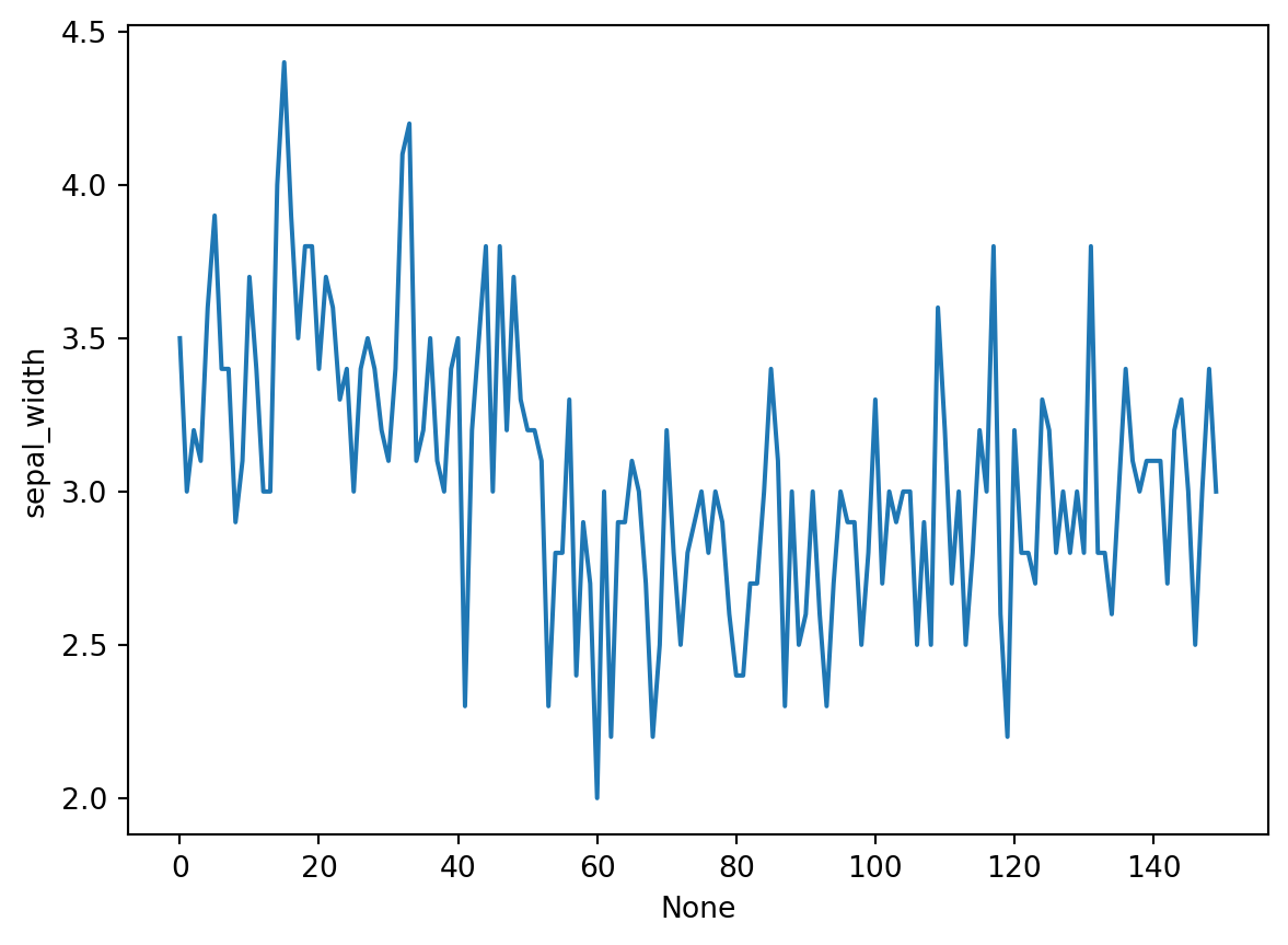
Grouping
# plotting the line chart
fig = px.line(df, y="sepal_width", line_group='species')

# showing the plot
fig.show()
# plotting the line chart
fig = px.line(df, y="sepal_width", line_dash='species',
color='species')
# showing the plot
fig.show()Bar Chart
# Loading the data
df = px.data.tips()

# Creating the bar chart
fig = px.bar(df, x='day', y="total_bill")

fig.show()
Grouping
# Creating the bar chart
fig = px.bar(df, x='day', y="total_bill", color='sex',
             facet_row='time', facet_col='sex')

fig.show()
Scatter Plot
# plotting the scatter chart
fig = px.scatter(df, x='total_bill', y="tip")

# showing the plot
fig.show()
Grouping
# plotting the scatter chart
fig = px.scatter(df, x='total_bill', y="tip", color='time',
                 symbol='sex', size='size', facet_row='day',
                 facet_col='time')

# showing the plot
fig.show()
Histogram
# plotting the histogram
fig = px.histogram(df, x="total_bill")

# showing the plot
fig.show()
Grouping
# plotting the histogram
fig = px.histogram(df, x="total_bill", color='sex',
                   nbins=50, histnorm='percent',
                   barmode='overlay')

# showing the plot
fig.show()
Pie Chart
# plotting the pie chart
fig = px.pie(df, values="total_bill", names="day")

# showing the plot
fig.show()
Donut Chart
# plotting the donut chart
fig = px.pie(df, values="total_bill", names="day",
             color_discrete_sequence=px.colors.sequential.RdBu,
             opacity=0.7, hole=0.5)

# showing the plot
fig.show()
Box Plot
# plotting the boxplot
fig = px.box(df, x="day", y="tip")

# showing the plot
fig.show()
Grouping
# plotting the boxplot
fig = px.box(df, x="day", y="tip", color='sex',
             facet_row='time', boxmode='group',
             notched=True)

# showing the plot
fig.show()
Violin Plot
# plotting the violin plot
fig = px.violin(df, x="day", y="tip")

# showing the plot
fig.show()
Grouping
# plotting the violin plot
fig = px.violin(df, x="day", y="tip", color='sex',
                facet_row='time', box=True)

# showing the plot
fig.show()
3D Plot
# plotting the figure
fig = px.scatter_3d(df, x="total_bill", y="sex", z="tip")

fig.show()
Grouping
# plotting the figure
fig = px.scatter_3d(df, x="total_bill", y="sex", z="tip", color='day',
                    size='total_bill', symbol='time')

fig.show()
Adding interaction
Untuk memunculkan tombol-tombol interaktif pada plot, kita menggunakan submodule dari library plotly yaitu plotly.graph_objects
Sliders and Selectors
x = df['total_bill']
y = df['tip']

plot = go.Figure(data=[go.Scatter(
    x=x,
    y=y,
    mode='markers',)
])

plot.update_layout(
    xaxis=dict(
        rangeselector=dict(
            buttons=list([
                dict(count=1,
                    step="day",
                    stepmode="backward"),
            ])
        ),
        rangeslider=dict(
            visible=True
        ),
    )
)

plot.show()
Lebih lanjut silakan buka dokumentasi library plotly pada link berikut : Dokumentasi Plotly
Untuk memperbaiki dan meningkatkan kualitas praktikum kedepannya, silakan berikan feedback anda melalui link berikut : Feedback Praktikum EDA 2023/2024