modul Quarto
Panduan Membuat website Quarto dari Nol
Gambaran Ikhtisar
Websites Quarto adalah cara nyaman untuk mempublish kumpulan dokumen. Dokumen dipublish sebagai bagian dari website yang membagikan elemen Navigasi, opsi rendering dan style visual.
Navigasi Website dapat di sajikan dalam sebuah navbar global, sebuah sidebar dengan link, atau kombinasi dari kedua untuk situs yang memiliki tingkatan multiple konten. Kalian dapat juga menyalakan full text search untuk website.
Website quarto dapat dipublish ke dalam varietas destinasi yang lebih luas termasuk GitHub Pages, Netlify, Posit Connect, atau layanan hosting static atau intranet server web. Detail tambahan untuk dokumentasi Publishing Websites.
Quick Start
Ikuti Quick Start untuk alat kalian dari pilihan untuk langsung dapat up website dan running. Setelah dasarnya paham, baca untuk belajar tentang navigasi website dan fitur lebih website tingkat lanjut.
Untuk membuat sebuah project website baru dengan VS Code, eksekusi Quarto: Create Project command dari the command-palette:

Maka, pilih Website Project:

Kalian akan di prompt untuk memilih direktori parent untuk membuat project di dalamnya. Kalian akan ditanya nama direktori untuk project website nya:

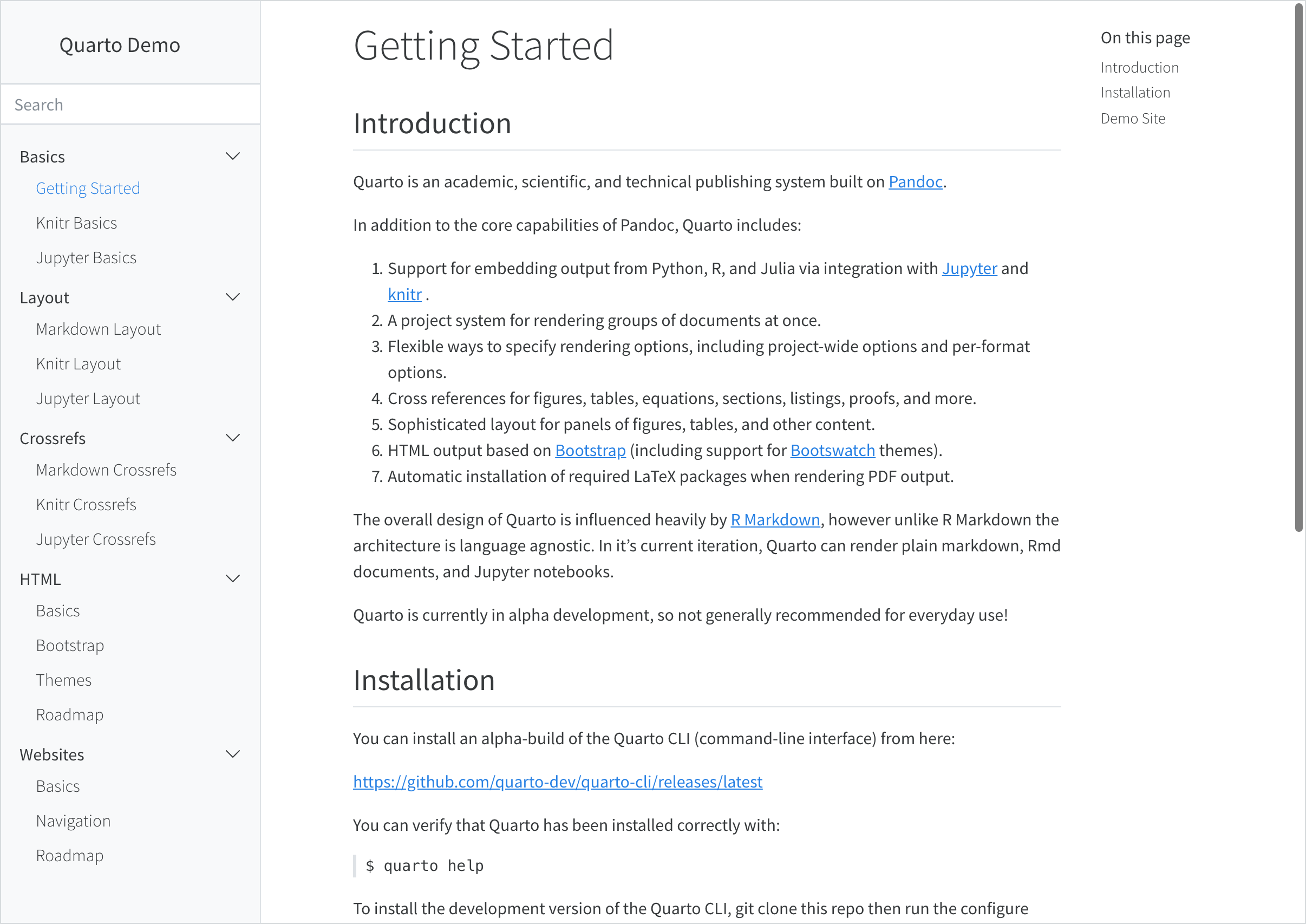
Project website baru akan terbuat dan dibuka dalam VS Code. Click preview button ( ) untuk preview websitenya:

Preview ini akan menunjukkan tepat ke sumber file. Ketika re-render index.qmd atau render files lainnya seperti about.qmd, preview otomatis diperbarui.
Untuk membuat website projek baru dengan RStudio, gunakan New Project command dan pilih Quarto Website:


Maka, sajikan sebuah nama direktori dan opsi relevan lainnya untuk website:

Click tombol Render untuk preview website:

Preview ini akan menunjukkan tepat ke sumber file. Ketika re-render index.qmd atau render files lainnya seperti about.qmd, preview otomatis diperbarui.
Untuk membuat project website baru dari Terminal, gunakan quarto create project command, diikuti prompt untuk memiliki tipe dan memberi nama untuk projek tersebut (yang akan digunakan untuk nama direktori tersebut):
Terminal
quarto create project website mysiteIni akan membuat panggung untuk website sederhana di dalam mysite sub-directory. Gunakan quarto preview command untuk render dan preview website:
Terminal
quarto preview mysitePreview website ini akan membuka di dalam web browser baru. Ketika kalian edit dan simpan index.qmd (atau file lain seperti about.qmd) preview ini otomatis diperbarui.
Workflow atau alur cara kerja
Di atas kita telah demonstrasikan bagaimana cara membuat dan edit website sederhana. Pada bagian ini kita lebih mendalam pada alur cara kerja website.
Config File
Setiap website punya _quarto.yml file config itu menyajikan opsi website sebagaimana defaults untuk dokumen HTML yang dibuat di dalam site. Contoh, disini secara default config file untuk situs sederhana yang dibuat di atas:
_quarto.yml
project:
  type: website

website:
  title: "today"
  navbar:
    left:
      - href: index.qmd
        text: Home
      - about.qmd

format:
  html:
    theme: cosmo
    css: styles.css
    toc: true
Lihat dokumentasi di Navigasi Website dan alat website di bawah untuk detail tambahan untuk konfigurasi website. Lihat HTML Documents untuk detail mengkustomisasi opsi format HTML.
Website Preview
Jika menggunakan VS Code atau RStudio, tombol Preview (VS Code), atau tombol Render (RStudio), render secara otomatis renders dan jalankan quarto preview di dalam sebuah embedded window. Kalian juga bisa lakukan yang sama dari Terminal jika dibutuhkan:
Terminal
# preview the website in the current directory
quarto preview
Perhatikan bahwa ketika preview sebuah site (entah gunakan VS Code / RStudio alat terintegrasi atau dari terminal) perubahan file configurasi (yakni _quarto.yml) sebagai sumber data situs (yakni thema atau file CSS) akan secara otomatis memperbaharui website.
Kalian dapat mengkustomisasi perilaku bagaimana server preview (port, apakah di buka di browser terbuka dll.) gunakan opsi command line atau _quarto.yml file config. Lihat quarto preview help atau project file reference untuk detail tambahan.
Ketika kalian preview situsmu, halaman akan dirender dan diperbaharui. Bagaimanapun juga, jika kamu buat perubahan di opsi global (yakni _quarto.yml atau termasuk file di dalamnya) kalian butuh secara penuh re-render situs kalian untuk memiliki semua perubahan yang direfleksikan. Konsekuensinya adalah kalian harus selalu quarto render situsnya sebelum deploy, bahkan jika kalian telah preview perubahan untuk beberapa halaman dengan preview server.
Website Render
Untuk merender (tapi tidak preview) sebuah website, gunakan quarto render command, yang mana akan merender ke _site directory secara default:
Terminal
# merender website dalam direktori ini
quarto render
Lihat artikel Project Basics untuk mempelajari lebih tentang pekerjaan terkait dengan projects, termasuk secara spesifik list eksplisit file untuk dirender, sebagaimana tambahan custom pre dan post render scripts untuk project kalian.
Render Targets
Secara default, semua input Quarto yang valid (.qmd, .ipynb, .md, .Rmd) di dalam direktori project akan di render, simpan salah satu dari:
Sebuah file atau prefix direktori
.(hidden files)Sebuah file atau prefix direktori
_(secara tipe digunakan untuk file non top-level, yakni termasuk A file or directory prefix of_(typically used for non top-level files, yakni satu included di file lain)File bernama
README.mdatauREADME.qmd(yang mana secara tipe tidak aktual render targets tapi konten informational sedikit sumber kode untuk dilihat di dalam web UI version control).
Jika kalian tidak ingin render semua target dokumen di dalam sebuah project, atau kalian harapkan untuk urutan secara precise rendering, kalian dapat menambahkanproject: render: [files] entry untuk metadata project kalian. Contoh:
project:
  render:
    - section1.qmd
    - section2.qmd
Perhatikan bahwa kalian dapat menggunakan wildcards ketikan mendefinisikan list render. Misalnya:
project:
  render:
    - section*.qmd
Kalian dapat juga menggunakan prefix (awalan ! untuk menghiraukan beberapa file atau direktori dalam list render. Perhatikan bahwa kasus kalian butuh dimulai dengan menspesifikasikan semua yang kalian ingin render. Misalnya:
project:
  render:
    - "*.qmd"
    - "!ignored.qmd"
- "!ignored-dir/"Jika sebuah nama dari file output membutuhkan dimulai dengan . atau _ (misalnya _index.md untuk pengguna Hugo), Kalian harus memberi nama Quarto file input tanpa prefix (misalnya index.qmd) dan tambahkan secara eksplisit output-file parameter di dalam YAML seperti
---
output-file: _index.md
---
Linking
Ketika membuat link di antara halaman site kalian, kalian dapat memberikan sumber file sebagai target link (daripada .html file). Kalian juga dapat memberikan identifier hash (tanda pagar #) ke seumber file jika kalian ingin ke link bagian secara khusus di dokumen. Misalnya:
[about](about.qmd)
[about](about.qmd#section)
Salah satu keuntungan dari penggunaan style ini dari link mengarah ke targeting .html files secara langsung itu jika kalian pada titik tertentu ingin mengubah website ke buku dasar file ini akan menautkan secara otomatis ke bagian link untuk format yang menghasilkan single file (misalnya PDF atau MS Word).
Website Theme
Tampilan website mu dikontrol via HTML themes. Opsi ini telah diatur dibawah opsi format dalam website configuration file mu:
_quarto.yml
format:
  html:
    theme: cosmo
    css: styles.css
Lihat HTML Theming untuk detail opsi yang tersedia.
Learning More
Sekali kalian dapat dasar up website dan menjalanakna check out artikel ini. Beragam cara lainnya unruk meningkatkan site kalian adalah:
Website Navigation mendeskripsikan berbagai cara untuk menambahkan navigasi ke website, termasuk bar navigasi tingkat tinggi, sidebar atau menggunakan kedua desain hybrid. Bagian ini juga meliputi penambahan pencarian full-text dan juga footer situs yang lebar.
Website Tools meliputi penambahan metadata social (seperti kartu twitter) dan analitik Google untuk situsmu, sebagaimana pengguna memverifikasi toggle di antara skema warna terang dan gelap.
Website Options menyajikan referensi komprehensif kepada semua opsi website yang tersedia.
Code Execution menyajikan tips untuk optimisasi merender website dengan banyak dokumen atau komputasi yang mahal.
Publishing Websites menyebutkan berbagai opsi untuk menerbitkan situs web termasuk Halaman GitHub, Netlify, dan Posit Connect.
Website Navigation
Gambaran Ikhtisar
Ada berbagai opsi yang tersedia untuk menyediakan navigasi situs web, termasuk:
Menggunakan navigasi atas (navbar) dengan sub-menu opsional.
Menggunakan navigasi samping dengan hierarki halaman.
Menggabungkan navigasi atas dan samping (di mana navigasi atas menautkan ke berbagai bagian situs dengan navigasi sampingnya sendiri).
Selain itu, kalian dapat menambahkan pencarian teks lengkap ke antarmuka navigasi atas atau samping.
Top Navigation
Untuk menambahkan navigasi teratas ke situs web, tambahkan entri navbar ke konfigurasi `website di _quarto.yml. Misalnya, YAML berikut:
website:
  navbar:
    background: primary
    search: true
    left:
      - text: "Home"
        href: index.qmd
      - talks.qmd
      - about.qmd
Menghasilkan bilah navigasi yang terlihat seperti ini:

Di atas kami menggunakan opsi kiri untuk menentukan item untuk sisi kiri bilah navigasi. Kalian juga dapat menggunakan opsi kanan untuk menentukan item untuk sisi kanan.
Teks untuk item bilah navigasi akan diambil dari judul dokumen target yang mendasarinya. Perhatikan bahwa dalam contoh di atas kami menyediakan nilai text: "Home" khusus untuk index.qmd.
Kalian juga dapat membuat menu bilah navigasi dengan menyertakan menu (yang merupakan daftar item seperti kiri dan kanan). Misalnya:
left:
  - text: "More"
    menu:
      - talks.qmd
      - about.qmd
Berikut adalah semua opsi yang tersedia untuk navigasi teratas:
| Opsi | Deskripsi |
|---|---|
title |
Judul navbar (menggunakan site: title jika tidak ada yang ditentukan). Gunakan title: false untuk menekan tampilan judul di bilah navigasi. |
logo |
Gambar logo yang akan ditampilkan di sebelah kiri judul. |
logo-alt |
Teks alternatif untuk gambar logo. |
logo-href |
Targetkan href dari logo /title navbar. Secara default, logo dan tautan judul ke halaman root situs (/index.html). |
background |
Warna Latar Belakang (“primary”, “secondary”, “success”, “danger”, “warning”, “info”, “light”, “dark”, or hex color). |
foreground |
Warna latar depan (“primary”, “secondary”, “success”, “danger”, “warning”, “info”, “light”, “dark”, or hex color). Warna latar depan akan digunakan untuk mewarnai elemen navigasi, teks, dan tautan yang muncul di bilah navigasi. |
search |
Sertakan kotak pencarian (true or false). |
tools |
Daftar alat navbar (seperti link ke github atau twitter, dll.). Lihat Navbar Tools untuk detail. |
left / right |
Daftar item navigasi untuk sisi kiri dan kanan navbar. |
pinned |
Selalu tampilkan bilah navigasi (true or false). Defaults ke false, dan menggunakan headroom.js untuk menampilkan bilah navigasi secara otomatis saat pengguna menggulir ke atas pada halaman. |
collapse |
Menciutkan item navbar ke dalam menu hamburger saat tampilan menjadi sempit (defaults ke true). |
collapse-below |
Breakpoint responsif untuk menciutkan item navbar ke menu hamburger (“sm”, “md”, “lg”, “xl”, or “xxl”, defaults ke “lg”). |
toggle-position |
Posisi menu hamburger navbar yang diciutkan saat dalam mode responsif (“left” or “right”, defaults ke “left”). |
tools-collapse |
Perkecil alat ke dalam menu navbar saat tampilan menjadi sempit. |
Berikut adalah opsi yang tersedia untuk item navigasi individual:
| Opsi | Deskripsi |
|---|---|
href |
Tautkan ke file yang berisi proyek atau URL eksternal. |
text |
Teks yang akan ditampilkan untuk item navigasi (default ke title dokumen jika tidak disediakan). |
icon |
Nama salah satu standar Bootstrap 5 icons (misalnya “github”, “twitter”, “share”, dll.). |
aria-label |
Accessible label untuk item navigasi. |
rel |
Nilai untuk rel atribut. Beberapa nilai yang dipisahkan spasi diizinkan. |
target |
Nilai untuk target atribut. Misalnya _blank untuk buka di tab baru. |
menu |
Daftar item navigasi untuk mengisi menu tarik-turun. |
Untuk informasi selengkapnya tentang mengontrol tampilan bilah navigasi menggunakan tema HTML, lihat HTML Themes - Navigation.
Navbar Tools
Selain navigasi tradisional, navbar juga dapat menampilkan seperangkat alat (misalnya social actions, GitHub view atau edit actions dll.) Definisi alat terdiri dari nama ikon dan href untuk diikuti saat diklik. Untuk ikon, gunakan nama ikon dari salah satu dari 1.300+ Ikon Bootstrap.
Contoh:
website:
  navbar:
    tools:
      - icon: twitter
        href: https://twitter.com
      - icon: github
        menu:
          - text: Source Code
            href:  https://code.com
          - text: Report a Bug
            href:  https://bugs.com
Alat yang ditentukan untuk bilah navigasi akan muncul di sisi kanan Bilah Navigasi. Jika kalian menentukan tema gelap atau mode pembaca untuk situs web kalian, kontrol untuk opsi tersebut akan muncul dengan alat apa pun yang ditentukan.
Saat bilah navigasi diciutkan menjadi menu di layar yang lebih kecil, alat akan ditempatkan di bagian bawah menu.
Side Navigation
Jika situs kalian terdiri dari lebih dari beberapa dokumen, kalian mungkin lebih suka menggunakan navigasi samping, yang memungkinkan kalian menampilkan hierarki artikel yang sangat dalam.
Jika kalian membaca halaman ini di perangkat desktop, kalian akan melihat tampilan navigasi sisi default di sebelah kiri (jika tidak, kalian akan melihat bilah judul di bagian atas yang dapat kalian klik atau sentuh untuk membuka navigasi).
Untuk menambahkan navigasi samping ke situs web, tambahkan entri sidebar ke bagian websitedi _quarto.yml. Misalnya:
website:
  sidebar:
    style: "docked"
    search: true
    contents:
      - text: "Introduction"
        href: introduction.qmd
      - section: "Basics"
        href: basics-summary.qmd
        contents:
          - index.qmd
          - basics-knitr.qmd
          - basics-jupyter.qmd
      - section: "Layout"
        contents:
          - layout.qmd
          - layout-knitr.qmd
          - layout-jupyter.qmd
      - section: advanced.qmd
        contents:
          - raw-code.qmd
          - custom-theme.qmd
      - acknowlegment.qmd
Ada dua gaya navigasi samping yang tersedia: “docked” yang menampilkan navigasi di bilah sisi dengan warna latar belakang yang berbeda, dan “floating” yang menempatkannya lebih dekat ke teks isi utama. Seperti inilah tampilan gaya “docked” dan “floating” (masing-masing):
 |
 |
Berikut adalah semua opsi yang tersedia untuk navigasi samping:
| Option | Description |
|---|---|
id |
Optional identifier (used only for hybrid navigation, described below). |
title |
Sidebar title (uses the project title if none is specified). |
logo |
Optional logo image. |
logo-alt |
Alternate text for the logo image. |
logo-href |
Target href from sidebar logo. By default, the logo and title link to the root page of the site (/index.html). |
search |
Include a search box (true or false). Note that if there is already a search box on the top navigation bar it won’t be displayed on the sidebar. |
tools |
List of sidebar tools (e.g., link to github or twitter, etc.). See the next section for details. |
contents |
List of navigation items to display (typically top level items will in turn have a list of sub-items). |
style |
“docked” or “floating”. |
type |
“dark” or “light” (hint to make sure the text color is the inverse of the background). |
background |
Background color (“none”, “primary”, “secondary”, “success”, “danger”, “warning”, “info”, “light”, “dark”, or “white”). Defaults to “light”. |
foreground |
Foreground color (“primary”, “secondary”, “success”, “danger”, “warning”, “info”, “light”, “dark”, or hex color). The foreground color will be used to color navigation elements, text and links that appear in the sidebar. |
border |
Whether to show a border on the sidebar. “true” or “false”. |
alignment |
Alignment (“left”, “right”, or “center”). |
collapse-level |
Whether to show sidebar navigation collapsed by default. The default is 2, which shows the top and next level fully expanded (but leaves the 3rd and subsequent levels collapsed). |
pinned |
Always show a title bar that expands to show the sidebar at narrower screen widths (true or false). Defaults to false, and uses headroom.js to automatically show the navigation bar when the user scrolls up on the page. |
A single sidebar item without an id or title will result in a global sidebar applied to all pages. A sidebar with an id or title will only be applied to pages within the contents of the sidebar or pages that specify the sidebar id.
To use a specific sidebar on a page or a group of pages, specify the sidebar ID in the front matter of the page or in the _metadata.yml file. For example, to include the sidebar with id: tutorials on a page, add the following to the page’s front matter:
sidebar: tutorialsFor more information on controlling the appearance of the side navigation using HTML themes, see HTML Themes - Navigation. If you need to control the width of the sidebar, see Page Layout - Grid Customization.
Auto Generation
Above we describe how to explicitly populate the contents of your sidebar with navigation items. You can also automatically generate sidebar navigation from the filesystem. The most straightforward way to do this is to specify the contents option as follows:
sidebar:
  contents: auto
Using contents: auto at the root level will result in all documents in your website being included within the navigation (save for the home page which can be navigated to via the title link). Navigation is constructed using the following rules:
Navigation item titles will be read from the
titlefield of documents.Sub-directories will create sections and will be automatically titled based on the directory name (including adding capitalization and substituting spaces for dashes and underscores). Use an
index.qmdin the directory to provide an explicittitleif you don’t like the automatic one.Order is alphabetical (by filename) unless a numeric
orderfield is provided in document metadata.
Automatic navigation automatically includes items in sub-directories. If you prefer not to do this, use an explicit /* to indicate only the documents in the root directory:
sidebar:
  contents: /*
Rather than specifying that all documents should be included, you can also specify a directory name or a glob pattern. For example, the following values for contents are all valid (note that the second form for reports is non-recursive):
sidebar:
  contents: reports

sidebar:
  contents: reports/*

sidebar:
  contents: "*.ipynb"
Note that in YAML we need to quote any strings that begin with * (as we do above for *.ipynb).
You can automatically build sidebar contents anywhere within a sidebar hierarchy. For example, here we add a section that is automatically generated from a directory:
sidebar:
  contents:
    - about.qmd
    - contributing.qmd
    - section: Reports
      contents: reports
You can also include automatically generated items in the middle of a list of normal items by including an item with an auto property. Here we add an auto entry in the middle of a list of items:
sidebar:
  contents:
    - about.qmd
    - contributing.qmd
    - auto: "*-report.qmd"
Note again that we quote the auto entry with a * in it so that it is correctly parsed.
Sidebar Tools
In addition to traditional navigation, the sidebar can also display a set of tools (e.g., social actions, GitHub view or edit actions, etc.) A tool definition consists of an icon name and an href to follow when clicked. For icon, use the icon name of any of the 1,300+ Bootstrap Icons.
For example:
website:
  sidebar:
    tools:
      - icon: twitter
        href: https://twitter.com
      - icon: github
        menu:
          - text: Source Code
            href:  https://code.com
          - text: Report a Bug
            href:  https://bugs.com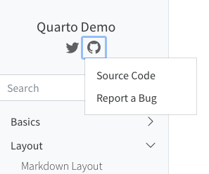
Hybrid Navigation
If you have a website with dozens or even hundreds of pages, you will likely want to use top and side navigation together, where the top navigation links to various sections, each with their own side navigation.
To do this, provide a group of sidebar entries and link each group of sidebar entries with a navbar entry by matching their titles and listing the page linked from the navbar as the first content in the sidebar group. For example, if you are using the Diátaxis Framework for documentation, you might have separate sections for tutorials, how-to guides, explanations, and reference documents, your page might look like the following.

With hybrid navigation, if then you click on, say, Tutorials, you might land in a page like the following.

To achieve this layout, your site configuration needs to look something like this:
website:
  title: ProjectX
  navbar:
    background: primary
    search: true
    left:
      - text: "Home"
        href: index.qmd
      - text: "Tutorials"
        href: tutorials.qmd
      - text: "How-To"
        href: howto.qmd
      - text: "Fundamentals"
        href: fundamentals.qmd
      - text: "Reference"
        href: reference.qmd

  sidebar:
    - title: "Tutorials"
      style: "docked"
      background: light
      contents:
        - tutorials.qmd
        - tutorial-1.qmd
        - tutorial-2.qmd

    - title: "How-To"
      contents:
        - howto.qmd
        # navigation items

    - title: "Fundamentals"
      contents:
        - fundamentals.qmd
        # navigation items

    - title: "Reference"
      contents:
        - reference.qmd
        # navigation items
Note that the first sidebar definition contains a few options (e.g., style and background). These options are automatically inherited by the other sidebars.
An alternative approach is to make the sidebar entries available from a drop down menu from the navbar items they’re grouped with. To do this, provide a list of sidebar entries and give them each an id, which you then use to reference them from the navbar.
A page that doesn’t appear in any sidebar will inherit and display the first sidebar without an id or title - you can prevent the sidebar from showing on a page by setting sidebar: false in its front matter.

To achieve this, your site configuration needs to look something like this:
website:
  title: ProjectX
  navbar:
    background: primary
    search: true
    left:
      - text: "Home"
        href: index.qmd
      - sidebar:tutorials
      - sidebar:howto
      - sidebar:fundamentals
      - sidebar:reference

  sidebar:
    - id: tutorials
      title: "Tutorials"
      style: "docked"
      background: light
      collapse-level: 2
      contents:
        # navigation items

    - id: howto
      title: "How-To"
      contents:
        # navigation items

    - id: fundamentals
      title: "Fundamentals"
      contents: :
        # navigation items

    - id: reference
      title: "Reference"
      contents:
        # navigation items
Breadcrumbs
By default, navigational breadcrumbs are displayed above the page title on each page that is nested deeper than one level in the sidebar navigation. For example, given this sidebar definition:
website:
  sidebar:
    - contents:
      - section: "Tutorials"
        contents:
          - text: "Tutorial Landing"
            href: tutorials.qmd
The page tutorials.html contains the following breadcrumb:

You can disable breadcrumbs for a website using the bread-crumbs option:
_quarto.yml
website:
  bread-crumbs: false
You can also disable breadcrumbs on individual pages:
document.qmd
---
title: Page without breadcrumbs
bread-crumbs: false
---Back to Top
You can include a “Back to top” link at the bottom of documents in a website using the back-to-top-navigation option. For example:
?meta:project-type:
  back-to-top-navigation: true
Note that you can disable back to top navigation on a page by page basis by specifying back-to-top-navigation: false.
Reader Mode
If you’d like users to be able to hide the side navigation and table of contents and have a more focused reading experience, you can enabled reader-mode. When enabled, a reader-mode toggle will appear on the navbar, if present, or on the sidebar. When pressed, the toggle will ‘roll up’ the sidebar and table of contents.

To enable reader-mode, use the following in your project:
website:
  reader-mode: true
Site Search
You can add site search by including search: true in either your site-navbar or site-sidebar configuration. For example:
website:
  sidebar:
    style: "docked"
    search: true
    contents:
      - section: "Basics"
        contents:
          - index.qmd
          - basics-jupyter.md
        # etc
GitHub Links
You can add various links (e.g., to edit pages, report issues, etc.) to the GitHub repository where your site source code is hosted. To do this, add a repo-url along with one or more actions in repo-actions. For example:
website:
  repo-url: https://github.com/quarto-dev/quarto-demo
  repo-actions: [edit, source, issue]
The links will be displayed immediately below the page’s table of contents:

There are a couple of additional options that enable you to customize the behavior of repository links:
| Option | Description |
|---|---|
repo-subdir |
Subdirectory of repository containing source files (defaults to root directory). |
repo-branch |
Repository branch containing the source files (defaults to main) |
issue-url |
Provide an explicit URL for the ‘Report an Issue’ action. |
repo-link-target |
The target attribute to use for repo action links. E.g., set to “_blank” to open in a new tab or window. |
repo-link-rel |
The rel attribute to use for repo action links. |
If you want to suppress the GitHub links on a specific page, you can set repo-actions to false in the document YAML:
page.qmd
---
repo-actions: false
---
Redirects
If you rename or move a page on your site, you may want to create redirects from the old URLs so that existing links don’t break. You can do this by adding aliases from old pages to renamed pages.
For example, let’s say you renamed page.qmd to renamed-page.qmd. You would add the following aliases entry to renamed-page.qmd to create the redirect:
---
title: "Renamed Page"
aliases:
  - page.html
---
This can also be useful for situations where you re-organize content on your site into a different directory hierarchy or break one large article into smaller ones. For this case, you may want to add the URL hash of the section that you have broken into a new page. For example:
---
title: "Learning More"
aliases:
  - overview.html#learning-more
---Depending on where you are deploying your site there may be more powerful tools available for defining redirects based on patterns. For example, Netlify _redirects files or .htaccess files. Search your web host’s documentation for “redirects” to see if any of these tools are available.
404 Pages
When a browser can’t find a requested web page, it displays a 404 error indicating that the file can’t be found. Browser default 404 pages can be pretty stark, so you may want to create a custom page with a more friendly message and perhaps pointers on how users might find what they are looking for.
Most web serving platforms (e.g., Netlify, GitHub Pages, etc.) will use a file named 404.html in the root of your website as a custom error page if you provide it. You can include a custom 404 page in a Quarto website by creating a markdown file named 404.qmd in the root of your project. For example:
---
title: Page Not Found
---

The page you requested cannot be found (perhaps it was moved or renamed).

You may want to try searching to find the page's new location.
Note that you can use HTML alongside markdown within your 404.qmd file in order to get exactly the appearance and layout you want.
Your 404 page will appear within the chrome of your site (e.g., fonts, css, layout, navigation, etc.). This is so that users don’t feel that they’ve irrecoverably “left” your site when they get a 404 error. If you don’t want this behavior, then provide a 404.html rather than 404.qmd.
Here are some examples of how various popular websites handle custom 404 pages: https://blog.fluidui.com/top-404-error-page-examples/.
Non-Root Site Paths
If your website is served from the root of a domain (e.g., https://example.com/) then simply providing a 404.qmd file as described above is all that’s required to create a custom 404 page.
However, if your website is not served from the root of a domain then you need to provide one additional bit of configuration to make sure that resources (e.g., your site’s CSS) are resolved correctly within 404 pages.
For example, if your site is served from https://example.com/mysite/ then you’d add the following to your project website configuration within _quarto.yml:
website:
  title: "My Site"
  site-path: "/mysite/"
Note that if you are already providing a site-url (which is required for generation of sitemaps and social metadata preview images) then it’s enough to simply include the path within the site-url:
website:
  title: "My Site"
  site-url: "https://example.com/mysite/"
Overview
Quarto makes it easy to create a simple about page for an individual or organization. When the about option is provided for a document, a special template will be used to layout the content of the current page with a custom layout designed to present a person or organization.
For example:
---
title: "Finley Malloc"
about:
  template: jolla
  image: profile.jpg
  links:
    - icon: twitter
      text: twitter
      href: https://twitter.com
    - icon: github
      text: Github
      href: https://github.com
---

Finley Malloc is the Chief Data Scientist at Wengo Analytics. When not innovating on data platforms, Finley enjoys spending time unicycling and playing with her pet iguana.

## Education

University of California, San Diego | San Diego, CA
PhD in Mathematics | Sept 2011 - June 2015

Macalester College | St. Paul, MN
B.A in Economics | Sept 2007 - June 2011

## Experience

Wengo Analytics | Head Data Scientist | April 2018 - present

GeoScynce | Chief Analyst | Spet 2012 - April 2018
The contents of this page will be laid out using the jolla template with the profile.jpg image, and generate a set of links for the items specified in links.
You can write and format the content of the page however you’d like - when the page is rendered, Quarto will use the content and options provided in the about option to create the about page, arranging the content of the about option with the content in the page itself.
Templates
Quarto includes 5 built in templates, drawing inspiration from the Postcards R Package. Built-in templates include:
jollatrestlessolanamarqueebroadside
Each template will position the about elements with the content in a different layout. Select the template using the template option:
about:
  template: trestles
Here is a preview of each of the templates:


Image
The image for the about page will be read from the document-level image option:
title: Finley Malloc
image: profile.jpg
about:
  template: jolla
In addition, you can customize how the image is displayed in the page to better meet your needs by setting the following options.
| option | description | templates |
|---|---|---|
image-width |
A valid CSS width for your image. | all |
image-shape |
The shape of the image on the about page. Choose from:rectangle, round, rounded |
jolla, solana, trestles |
image-alt |
Alternative text for image | all |
image-title |
Title for image | all |
For example:
title: Finley Malloc
image: profile.png
about:
  template: trestles
  image-width: 10em
  image-shape: round
Links
Your about page also may contain a set of links to other resources about you or your organization. Each template will render these links in a slightly different way. Here are the options that you can specify for each link:
| Option | Description |
|---|---|
href |
Link to file contained with the project or an external URL. |
text |
Text to display for navigation item (defaults to the document title if not provided). |
icon |
Name of one of the standard Bootstrap 5 icons (e.g. “github”, “twitter”, “share”, etc.). |
aria-label |
Accessible label for the navigation item. |
Partial Page Content
By default, the about page will be generated using the entire contents of the page. If you’d like, however, you may also choose to use only a portion of the page’s content to populate the about template. In this case, you can specify an id for the about page in the document front matter. When rendering the page, Quarto will find any div with that id and use the contents of that div to populate the about template. The div that provided the contents will be replaced with the formatted ‘about’ content. For example, you could write:
---
title: "Finley Malloc"
about:
  id: hero-heading
  template: jolla
  image: profile.jpg
  links:
    - icon: twitter
      text: twitter
      href: https://twitter.com
    - icon: github
      text: Github
      href: https://github.com
---

### This content appears above the formatted about page content.

:::{#hero-heading}

Finley Malloc is the Chief Data Scientist at Wengo Analytics. When not innovating on data platforms, Finley enjoys spending time unicycling and playing with her pet iguana.

## Education

University of California, San Diego | San Diego, CA
PhD in Mathematics | Sept 2011 - June 2015

Macalester College | St. Paul, MN
B.A in Economics | Sept 2007 - June 2011

## Experience

Wengo Analytics | Head Data Scientist | April 2018 - present

GeoScynce | Chief Analyst | Sept 2012 - April 2018

:::

### This content appears below the formatted about page content.
Overview
Quarto websites include integrated support for blogging. Blogs consist of a collection of posts along with a navigational page that lists them in reverse chronological order. Blogs can include a custom about page, publish an RSS feed, and use a wide variety of themes.
You can create websites that consist entirely of a single blog, websites that have multiple blogs, or you can add a blog to a website that contains other content.
Quick Start
Follow the Quick Start for your tool of choice to get a simple blog up and running. After covering the basics, read on to learn about more advanced blog features.
To create a new blog project within VS Code, execute the Quarto: Create Project command from the command-palette:
Then, select Blog Project:

You’ll be prompted to select a parent directory to create the project within. Then, you’ll be asked to name the directory for your blog project:
The new blog project will be created and opened within VS Code. Click the Preview button () to preview the blog:

The preview will show to the right of the source file. As you re-render index.qmd or render other files like about.qmd, the preview is automatically updated.
To create a new blog project within RStudio, use the New Project command and select Quarto Blog:

Then, provide a directory name and other relevant options for the blog:

Click the Render button to preview the blog:

The preview will show to the right of the source file. As you re-render index.qmd or render other files like about.qmd, the preview is automatically updated.
To create a new blog project from the Terminal, use the quarto create project command with blog, specifying the directory that will hold the new project as first argument:
Terminal
quarto create project blog myblogThis will create the scaffolding for a simple blog in the myblog sub-directory. Use the quarto preview command to render and preview the blog:
Terminal
quarto preview myblogThe blog preview will open in a new web browser. As you edit and save index.qmd (or other files like about.qmd) the preview is automatically updated.
Here’s a summary of the key files created within the starter blog project:
| File | Description |
|---|---|
_quarto.yml |
Quarto project file. |
index.qmd |
Blog home page. |
about.qmd |
Blog about page. |
posts/ |
Directory containing posts |
posts/_metadata.yml |
Shared options for posts |
styles.css |
Custom CSS for website |
In the following sections we’ll take a closer look at the various components of the project.
Home Page
The home page is a listing page for all of the documents in the posts directory:

Here’s the source code for the home page:
---
title: "myblog"
listing:
  contents: posts
  sort: "date desc"
  type: default
  categories: true
---
When you render a new post, the listing page will automatically updated, adding the most recent post to the top of the list.
It is not recommended that you use dynamic dates (for example today or last-modified) in your blog posts. This will cause the order of your blog and feed to be changed each time the document is rendered or modified.
See the article on Listing Pages to learn more about customizing listings, including use a grid layout rather than the default shown above.
Categories
The listing page is configured to enable categories, which display in the right margin of the page:
---
title: "myblog"
listing:
  # (additional metadata excluded for brevity)
  categories: true
---
The categories are read from the front matter of documents included in the listing. For example, here is sample post metadata that includes categories:
---
title: "Post With Code"
description: "Post description"
author: "Fizz McPhee"
date: "5/22/2021"
categories:
  - news
  - code
  - analysis
---
See the article on Categories to learn more.
About Page
The about.qmd document includes additional information on the blog and its author. For example:
Here’s what the source code of an about.qmd might look like:
---
title: "About"
image: profile.jpg
about:
  template: jolla
  links:
    - icon: twitter
      text: Twitter
      href: https://twitter.com
    # (additional links excluded for brevity)
---

## About this blog

This is the contents of the about page for my blog.
See the article on About Pages to learn about the various options available for customizing page output.
Posts Directory
The posts that make up the contents of the blog are located in the posts directory.
Add a new post to your blog by creating a sub-directory within posts, and adding an index.qmd file to the directory. That qmd file is the new blog post and when you render that, the blog home page will automatically update to include the newest post at the top of the listing.
Drafts
Add draft: true to the document options to indicate a post is a draft. For example:
---
title: "My Post"
description: "Post description"
author: "Fizz McPhee"
date: "5/22/2021"
draft: true
---
Draft posts will appear when you preview the site, but will be blank when you render the site and will not appear in listings, navigation, the site map, or site search. You can read more about drafts in Website Drafts.
To publish the post when it is complete, simply remove draft: true from the document options and then render it.
Last Updated
To indicate the date of the last modification, but preserve the original publication date, you can add the date-modified field to the document options. For example:
---
title: "My Post"
description: "Post description"
author: "Fizz McPhee"
date: "5/22/2021"
date-modified: "5/23/2021"
---
Freezing Posts
Blogs posts that contain executable code often have the problem that posts created last year can’t be rendered this year (for example, because the packages used by the post have changed). A similar problem can also arise when a blog has multiple contributors and not everyone has the right software (or the right versions) to render all of the posts. Finally, posts that include computations can often take a while to render, and you don’t want the cumulative time required to render the site to grow too large.
The solution to these problems is to freeze the output of computational blog posts. When a post is rendered with freeze: true, the markdown output from the underlying engine (e.g. Jupyter or Knitr) is saved. When the entire site is rendered these computations are not re-run, but rather read from the previously frozen results.
The only time an article with freeze: true is rendered is when you explicitly re-render it. By specifying this option for blog posts you can ensure that posts rendered now will always re-render well with the rest of the site, even if the software required to originally render them isn’t available.
In the default blog we include a file (_metadata.yml) that establishes shared metadata for all documents within the posts directory. In this file, we specify that we want freeze: true set by default for all posts:
# options apply to all posts in this folder

# freeze computational output
freeze: true
See the article on the freeze option to learn more about freezing computational output within websites.
Themes
Blogs can use any of the 25 Bootswatch themes included with Quarto. You can also create your own themes. The default blog generated by quarto create project uses the cosmo theme. Here are links to the available themes along with thumbnails of what the simple default blog looks like under a few of them:


RSS Feed
Blogs typically include an RSS feed that allows their content to be easily syndicated to feed readers and other websites. You can enable RSS for a blog by doing the following:
In the
_quarto.ymlfile, add asite-urlanddescriptionto thewebsitekey (without these options being set in the project file, Quarto cannot generate a feed). For example:website: title: "myblog" site-url: https://www.myblogexample.io description: "A great sample blog"In your blog home page
index.qmdadd thefeed: trueoption to the listing. For example:--- title: "myblog" listing: contents: posts sort: "date desc" type: default categories: true feed: true ---
Now, when your site is rendered, an RSS feed will also be generated. To learn more, see the article on RSS Feeds.
You can add an RSS link to your navbar by including the following in your _quarto.yml project file. For example:
website:
  title: "myblog"
  site-url: https://www.myblogexample.io
  description: "A great sample blog"
navbar:
right:
- icon: rss
href: index.xmlCategory Feeds
You can also generate RSS feeds for specific categories in your blog. For example, to create feeds for the categories news and posts in a blog, you could write the following:
---
title: "myblog"
listing:
  contents: posts
  sort: "date desc"
  type: default
  categories: true
  feed:
    categories: [news, posts]
---
This will create an index.xml file with the RSS feed for the listing, but also create an index-news.xml and index-posts.xml file with RSS feeds for the respective categories.
Publishing
There are a wide variety of ways to publish Quarto blogs. Blog content is by default written to the _site sub-directory. Publishing is simply a matter of copying this directory to a web server or web hosting service.
The article on Publishing Websites describes in more detail how to publish to the following services:
Subscriptions
You may want to allow readers of your blog to subscribe to updates via email. You can use a third party email service to manage and send these emails.
Third party email services will typically take your RSS Feed as input (e.g. https://www.myblogexample.io/index.xml) and provide HTML for a subscription widget that you can place on your blog. A good place to locate that widget is often right margin of your blog.
Here are the steps required to add a subscription widget:
Use your email service features to generate the HTML for your subscription widget. MailChimp, for example, provides HTML like this for a minimal subscription widget.
<span style="font-weight: 600;">Subscribe</span> <!-- Begin Mailchimp Signup Form --> <link href="http://cdn-images.mailchimp.com/embedcode/slim-10_7_dtp.css" rel="stylesheet" type="text/css"> <style type="text/css"> #mc_embed_signup{background:#fff; clear:left; font:14px Helvetica,Arial,sans-serif; width:170px;} /* Add your own Mailchimp form style overrides in your site stylesheet or in this style block. We recommend moving this block and the preceding CSS link to the HEAD of your HTML file. */ #mc-embedded-subscribe-form{margin-left:-5px;} </style> <div id="mc_embed_signup"> <form action="<site_url>" method="post" id="mc-embedded-subscribe-form" name="mc-embedded-subscribe-form" class="validate" target="_blank" novalidate> <div id="mc_embed_signup_scroll"> <input type="email" value="" name="EMAIL" class="email" id="mce-EMAIL" placeholder="email address" required> <!-- real people should not fill this in and expect good things - do not remove this or risk form bot signups--> <div style="position: absolute; left: -5000px;" aria-hidden="true"><input type="text" name="b_f718424fc5df77c22533bdaa6_a3c37fb57b" tabindex="-1" value=""></div> <div class="optionalParent"> <div class="clear foot" style="margin-top: 10px;"> <input type="submit" value="Subscribe" name="subscribe" id="mc-embedded-subscribe" class="button"> <p class="brandingLogo"></p> </div> </div> </div> </form> </div> <!--End mc_embed_signup-->WarningThe above widget HTML will not work in your blog as the subscription HTML needs to contain value specific to your blog. See your email service provider’s instructions for generating a subscription widget.
Create the file
subscribe.htmlin the root of your project.Paste the HTML for your subscription widget into
subscribe.htmland save the file.Add
subscribe.htmlto themargin-headerin your_quarto.ymlfile:website: # (additional metadata excluded for brevity) margin-header: subscribe.html
The result looks like this:

Overview
Use drafts to preview and plan content before it is ready to publish. By default, draft pages will be blank in your rendered site, and will not appear in navigation, listings, search results, or the sitemap. On this page, learn how to specify pages as drafts, control how drafts appear in rendered sites and how drafts appear in site previews.
Specifying Drafts
To specify a page or post is a draft, you can add draft: true to the document YAML:
posts/post-with-code/index.qmd
---
title: "Post with Code"
draft: true
---
To specify all documents in directory are drafts set draft: true in the directory metadata:
posts/_metadata.yml
draft: trueAs an alternative to the draft document option, you can also specify the website option drafts in _quarto.yml:
_quarto.yml
website:
  title: "Cool Website."
  drafts:
    - posts/post-with-code/index.qmd
If you would like to specify a list of paths in a separate file, use a metadata include. For example, you could specify your drafts in drafts.yml:
drafts.yml
website:
  drafts:
    - posts/post-with-code/index.qmd
Then, provide this file to metadata-files:
_quarto.yml
website:
  title: "Cool Website."

metadata-files:
  - drafts.yml
You can also set the website drafts option using project profiles.
Appearance of Drafts
You can use the draft-mode option to control the content and linking of draft documents in the rendered website. The values for draft-mode are:
gone(default)—Empty and unlinkedunlinked—Rendered and unlinkedvisible—Rendered and linked
A URL will exist for an empty page but the page itself will be blank. Drafts that are rendered will additionally include a draft banner:

When a draft is unlinked it will not appear in search results, listings, the sitemap, or navigation (sidebars, navbars, and footers). If another page links to an unlinked draft document, the link will be omitted leaving the content of the link without the hyperlink itself.
As a complete example, consider the following website configuration:
_quarto.yml example
_quarto.yml
- 1
-
The project is providing a simple list of draft documents. The same thing could be specified using
draft: trueinstuff/item2.qmd’s front matter. - 2
-
The draft mode is set to
unlinked, so drafts are rendered but not linked to.
When rendered the navbar in the above site will omit the item for stuff/item2.qmd:

However, stuff/item2.qmd is still available at stuff/item2.html and shows the draft banner:

Previewing Drafts
Regardless of the draft-mode setting, when you preview a site with quarto preview drafts will be visible. Draft pages will be rendered and display a draft banner, and any links or navigation items pointing at the draft pages will be visible and active. For example, when the site described in Listing 1, is previewed a link to stuff/item2.html appears in the navigation:

This preview behaviour includes previews generated with the Render button in RStudio, and the Preview button in VS Code.
Overview
In addition to the 3 built in types of listings, you can also build a completely custom display of the items. This custom display can generate any HTML and can optionally still take advantage of the sorting, filtering, and pagination provided by listings.
Listing Templates
To build a custom listing display, you create an EJS template that will be used to generate the HTML for a set of items that are passed to the template. EJS templates allow you to generate HTML using plain javascript, making it easy to loop through items and output their values in your custom HTML.
To use a custom template, pass it in the template option for a listing:
listing:
  template: gallery.ejs
When a listing with a custom template is rendered, the listing contents will be read and processed into a set of items that are passed to the template for rendering. For example, in this case, all the documents in the posts directory will be read into items and passed to the gallery.ejs template.
listing:
  contents: posts
  template: gallery.ejs
A simple template for outputing a list of documents might look like:
<ul>
<% for (const item of items) { %>
  <li><a href="<%- item.path %>"><%= item.title %></a></li>
<% } %>
</ul>
which produces simple HTML output like:

When rendered, the above template will receive an array of listing items called items. When the contents of a listing are loaded from a list of documents, each of those items will be populated with the fields described in Listing Fields. In addition, any other fields included in a documents metadata will be passed as a property of the item, making it possible to use custom metadata in your documents and the listing display.
Note that Quarto uses lodash to render the EJS templates. The lodash uses different syntax for HTML escaping text in templates.
HTML escaped value:   <%- value %>
HTML unescaped value: <%= value %>
Metadata Listings
The contents option for a listing most commonly contains a list of paths or globs, but it can also contain metadata. When contents are metadata, the metadata will be read into items and passed to the template. For example:
listing:
  template: custom.ejs
  contents:
    - name: First Item
      href: https://www.quarto.org
      custom-field: A custom value
    - name: Second Item
      href: https://www.rstudio.org
      custom-field: A second custom value
could be rendered using:
```{=html}
<ul>
<% for (const item of items) { %>
  <li>
    <a href="<%- item.href %>"><%= item.name %></a><br/>
    <%= item['custom-field'] %>
  </li>
<% } %>
</ul>
```
which produces a simple HTML display like:

Metadata File Listings
The contents option for a listing can also point to one or more yaml files (which contain metadata). In that case, the metadata will be read from the files into items and passed to the template. For example:
listing:
  template: custom.ejs
  contents:
    - items.yml
where the contents of items.yml is:
- name: First Item
  href: https://www.quarto.org
  custom-field: A custom value
- name: Second Item
  href: https://www.rstudio.org
  custom-field: A second custom value
Template Examples
Portions of this website are built using custom listings. The best place to start is with our gallery, which is a listing built using a custom template and a metadata file. You can view the source code used to create the gallery page in our Github repository.
| File | Description |
|---|---|
| gallery.yml | The metadata that controls what items are displayed in the gallery listing. |
| gallery.ejs | The template used to display the items on the page. |
| index.qmd | The Quarto document that configures and positions the listing in the #gallery div. |
Sorting, Filtering, and Pagination
By default, sorting, filtering, and pagination are disabled for custom listings templates, but with some simple changes to your template and listing options, you can add this capability to your custom listing. To do this, you need to include the following three things in your custom template:
Include a
listclass on the HTML tag that contains the list of items.For each item, include
<%= metadataAttrs(item) %>in the HTML tag that contains the item. This will allow Quarto to write custom attributes that are used for sorting and filtering.Within each item, include a class that identifies the tag whose text represents the contents of an item’s field. The class must be the name of the field prefixed with
listing-, for example the tag whose inner text is theitem.nameshould include a classlisting-name.
For example, we can modify the above custom.ejs template as follows:
<ul class="list">
<% for (const item of items) { %>
  <li <%= metadataAttrs(item) %>>
    <a href="<%- item.href %>" class="listing-name"><%= item.name %></a><br/>
    <span class="listing-custom-field"><%= item['custom-field'] %><span>
  </li>
<% } %>
</ul>
Once you have included these items in your template, you can then enable the options in your listing:
listing:
  sort-ui: true
  filter-ui: true
  page-size: 10
The UI elements will now appear on the page and should interact properly with your custom listing.
Field Display Names
You may want to provide a custom display name for your field to provide a better name than the field name. For example, the field name would appear in the sort UI. You can use field-display-names to create mapping from a field to a display name. For example:
listing:
  template: custom.ejs
  contents:
    - items.yml
  sort-ui: true
  filter-ui: true
  page-size: 10
  field-display-names:
    name: "Name"
    custom-field: "Custom"
Date Sorting and Formatting
To properly format and sort date values, you can specify type information for fields in your items. If you specify a field is a date, it will automatically be formatted using the specified date formatting (either default or specified using date-format) and will support date sorting in ascending or descending order. If you specify a field as a number, it will support ascending and descending numeric sorting.
You can specify field types as follows:
listing:
  template: custom.ejs
  contents:
    - items.yml
  field-types:
    custom-date: date
    custom-number: number
Required Fields
Since listings are generated using fields that are specified in other documents or via metadata, it can be helpful to ensure that required fields are present. You can note required fields as following:
listing:
  template: custom.ejs
  contents:
    - items.yml
  field-required: [name, custom-field]
If the listing page is rendered and any of contents is missing a value for either of the required fields, an error will be thrown noting the field that is required and the file or metadata that has omitted it.
Template Parameters
You may also make your custom template more dynamic by using parameters to control its behavior. You can provide parameters for custom templates using the template-params option like:
listing:
  template: custom.ejs
  contents:
    - items.yml
  template-params:
    param1: "param-value"
Template parameters can then be accessed in your template using <%= templateParams.param1 %>. For example, we can modify the above custom.ejs template as follows:
<h3><%= templateParams.param1 %></h3>
<ul class="pub-list list">
  <% for (const item of items) { %>
      <li <%= metadataAttrs(item) %>>
        <span class="listing-title"><%= item.title %>.</span>
      </li>
  <% } %>
</ul>
Overview
Listings enable you to automatically generate the contents of a page (or region of a page) from a list of Quarto documents or other custom data.
Listings are useful for creating blogs, providing navigation for large numbers of documents, or any other scenario where you’d like the contents of a page to be automatically updated as documents are added, updated, and removed.
You can enable listings on a page using the listing option in the document front matter. This will instruct Quarto to generate additional content (the ‘listings’) when the page is rendered. For example, the following YAML in the front matter of a document:
---
title: "Listing Example"
listing: default
---
will result in a listing of all documents in the directory (with the exception of the current document). It might look something like this:

Listing Contents
You can control what documents are included in the listing by using the contents option, which allows you to provide a set of input files (or globs of input files) that should be included in the listing. For each of the inputs that matches the contents of a listing, an item will be included using the metadata in the front matter of the document.
To have an item in the list, it must contain at least the “title” metadata.
For example to include all the Quarto documents in the posts directory, you would write:
---
title: "Listing Example"
listing:
  contents: posts
---
You can write much more complex rules for including content by using globs and using a list of targets in the contents, such as:
---
title: "Listing Example"
listing:
  contents:
    - "reports/*.qmd"
    - "lab-notes/*reports.qmd"
Review the Quarto Glob Reference for more information about supported glob syntax.
If you provide a path to a directory, it will be treated as <directory>/** - the directory will be searched recursively for project inputs.
It is important to note that when providing a list of targets, these will be identified relative to the location of the listings page, not the root of the project file. For example, if your listings page is located at /pages/listings.qmd specifying contents: "reports/*.qmd" will search in /pages/reports/ not /reports/ for the targeted files.
In addition to specifying lists of files or globs, contents can contain lists of metadata as well. For more about this, see Custom Listings.
Listing Types
There are three built-in types of listings that you can choose from. Use the type option to choose the appearance of the listing:
---
listing:
  contents: posts
  type: default
---
The type field accepts the following values:
| Type | Description |
|---|---|
default |
A blog style list of items. |
table |
A table of listings. |
grid |
A grid of listing cards. |
By default, listings will appear in full width rows that display the item’s metadata (author and date), title, description, and image.

Grid style listings display a card for each item.

The table listing style provides a traditional tabular layout.

Sorting Items
By default, listings created from documents will be ordered by their title. Use the sort option to control the order of the listing. For example:
listing:
  contents: posts
  sort: "date"
Each sort key can include a field name and optionally either asc or desc to control whether to sort in ascending or descending order. When only the name is specified, sorting by that field will be in ascending order.
The sort key can also contain one or more fields to sort by. For example:
listing:
  contents: posts
  sort:
    - "date"
    - "title desc"
This will sort the documents in the posts directory first by their date in ascending order, then by their title in descending order.
If you’d like to disable sorting entirely and display the items in the order in which they are specified, you can pass sort: false (which will disable sorting and preserve the item’s original order).
Listing Options
It is possible to customize the appearance of listings using the following options for each type of listing display.
Default
| Option | Description |
|---|---|
max-items |
The maximum number of items to include in this listing. |
image-align |
Whether to place the image on the right or left side of the post content. Defaults to right. |
image-height |
The height of the image being displayed. The width is automatically determined and the image will fill the rectangle without scaling (i.e. cropped to fill). |
image-placeholder |
The default image for items if they have no image. |
Grids
| Option | Description |
|---|---|
max-items |
The maximum number of items to include in this listing. |
image-height |
The height of the image being displayed. The width is automatically determined and the image will fill the rectangle without scaling (i.e. cropped to fill). |
image-placeholder |
The default image for items if they have no image. |
grid-columns |
The number of columns in the grid display. Defaults to 3. |
grid-item-border |
Whether to display a border around the item card. Defaults to true. |
grid-item-align |
Aligns the content within the card (left, right, or center). Defaults to left. |
Tables
| Options | Description |
|---|---|
max-items |
The maximum number of items to include in this listing. |
image-height |
The height of the image being displayed. The width is automatically select and the image will fill the rectangle without scaling (i.e. cropped to fill). |
image-placeholder |
The default image for items if they have no image. |
table-striped |
Display the table rows with alternating background colors (true or false). Defaults to false |
table-hover |
Highlight rows of the table when the user hovers the mouse over them (true or false). Defaults to false. |
field-links |
A list of fields that should link to the document in the table (defaults to title). |
Advanced Options
| Option | Description |
|---|---|
field-display-names |
A mapping that provides display name for specific fields. For example, to display the title column as ‘Report’ in a table listing you would write: |
image-lazy-loading |
When true, listing images are loaded only as they come into view. When false, images are automatically loaded. Default: true |
max-description-length |
The maximum length of the description displayed in the listing (in characters). Defaults to 175. |
date-format |
The date format to use when displaying dates (e.g. You may either provide a date style (
Learn more about supported date formatting values here. |
In addition to the above listing-wide options, each listing type has a variety of options to customize its appearance.
Categories
In addition to displaying the listing contents, listings can also automatically add a list of categories to the page that they appear on. To enable categories you can set the categories option like:
listing:
  categories: true
which results in categories appearing in the right sidebar:

When users click a category, the page will be updated to show only the listing items that match the selected category.
Category Appearance
You can choose between a few different display styles for categories:
| Option | Description |
|---|---|
numbered |
Displays a list of categories in alphabetical order with the number of items in that category displayed next to the category name. |
unnumbered |
Display a list of categories in alphabetical order. |
cloud |
Displays a ‘word cloud’ of categories. |
When multiple listings appear on the page, categories will be enabled based upon the option set in the first listing. If categories are enabled for the first listing, all listings on the page will contribute their item categories to the list of categories and all will be filtered when the user clicks a category.
Feeds
You can also have an RSS feed generated based upon the contents of a listing. This is great to allow your content to be syndicated or to be accessible via RSS Readers. Include a feed for your listing by including the feed option:
listing:
  contents: posts
  feed: true
When a feed is enabled for a listing on a page, an RSS file will be automatically generated using the name of the file. For example, index.qmd will produce a feed at index.xml. A link to the feed will be included in the head of the page as well.
Generating feeds requires that the site-url be set for the site in your _quarto.yml file. For example:
_quarto.yml
website:
  site-url: "https://www.quarto.org"
You can further customize your feed by passing options to the feed key:
listing:
  contents: posts
  feed:
    items: 10
The following options are available:
| Option | Description |
|---|---|
items |
The number of items to include in your feed. Defaults to 20. |
type |
full, partial or metadata. full, the default, includes the full contents of each document in the feed. partial includes the description, if available, otherwise the first paragraph in the feed. metadata includes only the title, description, and other document metadata in the feed. |
title |
The title for this feed. Defaults to the site title provided in your _quarto.yml file. |
image |
The image for this feed. If not specified, the image for the page the listing appears on will be used, otherwise an image will be used if specified for the site in your _quarto.yml file. |
description |
The description of this feed. If not specified, the description for the page the listing appears on will be used, otherwise the description of the site will be used if specified in your _quarto.yml file. |
language |
The language of the feed. Omitted if not specified. See https://www.rssboard.org/rss-language-codes for a list of valid language codes. |
categories |
Generates a separate feed for each of the categories included in this list of category names. |
Listing Fields
When reading the contents of a listing, Quarto uses the metadata read from the front matter of the document or the contents of the document itself to populate the following fields for each item:
| Field Name | Description |
|---|---|
title |
The title of the item, read from the title field of the front matter (or the first H1 of the document). |
subtitle |
The subtitle of the item, read from the subtitle field of the front matter. |
author |
The author of the item, read from the author field of the front matter. |
description |
The description of the item, read from the description or abstract field of the front matter or from the first paragraph of the document. |
date |
The date of the item, read from the date field of the front matter. |
image |
The image for this item, read from the image field of the front matter, or automatically discovered by taking the first of an image of class preview-image, an image with a file name starting with feature, cover, or thumbnail, or the first image to appear in the document. |
image-alt |
The alt text for the image for this item. |
word-count |
A word count for this item. |
reading-time |
An estimate of the reading time for this item, computed by counting the words in the item and assuming a reading speed of 200 words per minute. |
categories |
Categories for the item, read from the categories field of the front matter. |
filename |
The name of the input file. |
file-modified |
The last modified date of this input file. |
Depending upon the type of listing that you are using, different fields are displayed automatically:
| Field | Type: Default | Type: Table | Type: Grid |
|---|---|---|---|
title |
x | x | x |
subtitle |
x | ||
author |
x | x | x |
description |
x | x | |
date |
x | x | x |
image |
x | x |
Customizing Fields
Though specific columns are displayed by default, each of the types will allow you to display any of the above columns by using the fields options. For example, to display more fields in a table (as columns), you write:
listing:
  type: table
  contents: posts
  fields: [image, date, title, author, reading-time]
which produces:

Each type of listing will handle the fields in different ways.
- Default
-
For default type listings, the various fields will be placed logically, with the
imagein the right column, thetitle,subtitle, anddescriptionin the center column, and any other fields in the left column.
- Tables
-
For table type listings, the list of fields will be displayed as columns in the order that the fields appear in the list.
- Grid
-
For grid listings, the
image,title,subtitle,reading-time,categories,description,author, anddatefields will be arranged on the body of the card. Thefilenameandfile-modifiedfields will appear in the card footer. Any other fields will appear in a table at the bottom of the card body.
Including or Excluding Items
You can control what documents are included or excluding based upon the metadata of the items by using the include and exclude options. These options allow you to specify one or more field names and values that must be present or absent in order for the item to be included or excluded. For example, to include only items authored by Harlow or Tristan, you write:
listing:
  contents: posts
  type: grid
  include:
    author: "{Harlow,Tristan}*"
To exclude any items authored by Charles, you write:
listing:
  contents: posts
  type: grid
  exclude:
    author: "Charles*"
When including or excluding items based upon a string field value, Quarto will use glob syntax when comparing values. Any other type of comparison will be done by testing for equality.
User Tools
Listings support interactive tools to allow the viewer of the listing to sort, filter, or page through listings.
Sorting
Users can use the select box to choose how to sort the items in the listing (or in the case of tables, by clicking on the column headings). By default, the sorting control will allow the user to sort by title, date, or author. You can stop this UI from being displayed to the user with the option:
listing:
  sort-ui: false
You can control which fields are included in the sort list by providing a list of field names in the sort-ui key:
listing:
  sort-ui: [title, date]
Filtering
Listings include a filter box positioned on the top right of the listing content. The filter box allows readers to perform a ‘typeahead’ search of the listing contents. You can disable the filtering control using the option:
listing:
  filter-ui: false
By default, if the filtering control is enabling, all fields that are being displayed in the listing will be searchable. If you’d like to limit searching / filtering to specific fields, you can do so by providing a field list in the filter-ui key:
listing:
  filter-ui: [title, date]
Pagination
Listings also natively support pagination of the items. The default number of items displayed on a page depends up the listing type:
| Listing Type | Items Per Page |
|---|---|
default |
25 |
table |
30 |
grid |
18 |
You can control the number of items displayed per page using the option page-size:
listing:
  page-size: 36
Listing Location
By default, listings will simply be appended to the main content region of the page. If you’d like to control where a listing appears, set an id for that listing and use that id on a corresponding div in the page. For example, updating the page used in the previous example to this:
---
title: "Listing Example"
listing:
  id: sample-listings
  contents: posts
  sort: "date desc"
  type: table
---

You can review the following documents for additional information:

::: {#sample-listings}
:::

Learn more about Quarto [here](https://www.quarto.com).
Results in a listing page like:

Multiple Listings
You can place any number of listings on a single page. The following would populate two listings on a single page:
---
title: Team Documents
listing:
  - id: lab-reports
    contents: "lab-reports/*.qmd"
    type: table
  - id: meeting-notes
    contents: "meeting-notes/*.qmd"
    type: table
---

## Lab Reports

:::{#lab-reports}
:::

## Meeting Notes

:::{#meeting-notes}
:::
YAML Listing Content
In addition to populating a listing with inputs that match one or more globs, you can also provide items explicitly via a YAML file. For example, the following listing:
---
title: "Listing Example"
listing:
  id: sample-listings
  contents:
    - posts
    - archived-items.yaml
  sort: "date desc"
  type: table
---
will include all the documents in the posts directory, but will also merge in the contents of the archived-items.yaml file. The contents of the archived-items.yaml file should be a list of items, each of which is a map of field names to values. For example:
- title: "Archived Item 1"
  author: Norah Jones
  date: 2020-01-01
  path: "archived/archived-item-.html"
  categories: [archived, technology]
This is useful for cases such as migrating existing content to Quarto - you can begin creating new content as Quarto documents, but still include existing content in your listings by providing their metadata via a yaml file.
Overview
Quarto includes support for full text search of websites and books. By default, Quarto will automatically index the contents of your site and make it searchable using a locally built index. You can also configure Quarto search to use a hosted Algolia index.
Search Appearance
Search is enabled by default for websites and books. If the site has a navbar the search UI will appear on the navbar, otherwise it will appear on the sidebar. You can control the location of search with the following options:
| Option | Description |
|---|---|
location |
navbar or sidebar (defaults to navbar if one is present on the page). |
type |
overlay or textbox (overlay provides a button that pops up a search UI, textbox does search inline). |
For example:
website:
  search:
    location: navbar
    type: overlay
Note that the above example reflects the default behavior so need not be explicitly specified. Note also that search is enabled by default for websites (you can disable it with search: false).
The overlay option displays the search UI as follows:

The textbox option displays search like this:

When the search is displayed as a textbox, by default, there is no placeholder text. You can specify placeholder text using the search-text-placeholder key of the language option (note that this is at the top-level, not inside the website option):
language:
  search-text-placeholder: Search
Keyboard Shortcut
In addition to clicking on the search UI, users can activate search using the keyboard shortcuts ss, ff or //. You can override these shortcuts by specifying the keyboard-shortcut option. In this example, search will be activated with ?? or HH:
website:
  search:
    keyboard-shortcut: ["?", "H"]
Customizing Results
You can use the following search options to customize how search results are displayed:
| Option | Description |
|---|---|
limit |
The number of results to display in the search results. Defaults to 20. |
collapse-after |
The number of sections matching a document to show before hiding additional sections behind a ‘more matches’ link. Defaults to 2.
|
copy-button |
If true, the search textbox will include a small icon that when clicked will copy a url to the search results to the clipboard (this is useful if users would like to share a particular search with results). Defaults to false.
|
show-item-context |
Control whether page parents are displayed next to items in search results. Use
|


Using Algolia
In addition to the built-in search capability, Quarto websites can also be configured to use an external Algolia search index. When rendering a website, Quarto will produce a JSON file (search.json in the site output directory) which can be used to update an Algolia index. For more on creating indexes with Algolia, see Send and Update Your Data using Algolia.
Basic Configuration
In order for Quarto to connect to your Algolia index, you need to provide basic connection information in your Quarto project file. You can find this connection information for your Algolia index in the Dashboard in the API Keys section. The following basic connection information is required:
| Option | Description |
|---|---|
index-name |
The name of the index to use when performing a search. |
application-id |
The unique ID used by Algolia to identify your application. |
search-only-api-key |
The Search-Only API key to use to connect to Algolia.
Important
Be sure to use the Search Only API key, which provides read only access to your index and is safe to include in project files. Never use your Admin API key in a Quarto document or project. |
show-logo |
Displays a ‘search by Algolia’ logo in the footer of search results. |
For example:
website:
  search:
    algolia:
      index-name: <my-index-name>
      application-id: <my-application-id>
      search-only-api-key: <my-search-only-api-key>
Custom Index Schema
If you are simply using the search.json file generated by Quarto as your Algolia index, the above configuration information is all that is required to set up search using Algolia.
However, if you are generating an index in some other fashion, you may need to provide additional information to specify which fields Quarto should use when searching. You do this by including an index-fields key under algolia which specifies the names of specific fields in your index.
| Option | Description |
|---|---|
href |
The field to use to read the URL to this index entry. The user will be navigated to this URL when they select the matching search result. Note that Quarto groups results by URL (not including the anchor when grouping). This field is required (either as an existing field in your index or with a mapped field name). |
title |
The field to use to read the title of the index entry. This field is required (either as an existing field in your index or with a mapped field name). |
text |
The field to use to read the text of the index entry. This field is required (either as an existing field in your index or with a mapped field name). |
section |
The field to use to read the section of the index entry. Quarto groups results by URL and uses the section information (if present) to show matching subsections of the same document. This field is optional. |
Any or all of the above may be specified in your Quarto project file. For example:
website:
  search:
    algolia:
      index-name: <my-index-name>
      application-id: <my-application-id>
      search-only-api-key: <my-search-only-api-key>
      index-fields:
        href: url
        section: sec
        text: body
Algolia Insights
By default, Algolia provides a number of insights based upon the performance of your Algolia search. In addition, it may be helpful to understand more detailed tracking of the results that are viewed and clicked. You can enable click and conversion tracking using Algolia by setting the analytics-events to true:
website:
  search:
    algolia:
      index-name: <my-index-name>
      application-id: <my-application-id>
      search-only-api-key: <my-search-only-api-key>
      analytics-events: true
You can confirm that events are being properly sent to Algolia using the Event Debugger. Note that the click and conversion events use cookies to maintain an anonymous user identifier—if cookie consent is enabled, search events will only be enabled if cookie consent has been granted.
Advanced Configuration
In addition to the above configuration, you may also pass Algolia specific parameters when executing a search. For example, you may want to limit results to a particular facet or set of tags. To specify parameters, add the params key to your algolia yaml and provide params. For information about available parameters, see Algolia’s Search API Parameters.
For example:
website:
  search:
    algolia:
      index-name: <my-index-name>
      application-id: <my-application-id>
      search-only-api-key: <my-search-only-api-key>
      index-fields:
        href: url
        section: sec
        text: body
      params:
        tagFilters: ['tag1','tag2']
Disabling/Forcing Search
You can disable search for an individual document by adding search: false to the document metadata. For example:
---
title: "My Document"
search: false
---
If you’d like to disable search support for an entire website, you can do so by including the following in your _quarto.yml file:
website:
  search: false
Forcing the inclusion of individual elements
If you need elements from the document to be included in the search that otherwise wouldn’t, add the quarto-include-in-search-index class to the element. To include only a portion of a paragraph, etc, wrap the text in a span or a div and add the class to the element.
Announcement Bar

Add an announcement to display a prominent, customizable bar at the top of your website that grabs visitors’ attention. It’s perfect for highlighting important information, such as alerts, promotions, or updates. You can set an icon, make it dismissable, and even include formatted content like bold text. The announcement bar can be positioned to fit seamlessly within your site’s layout (e.g., below-navbar or above-navbar), ensuring the message is both impactful and integrated.
Here’s an example of how you might configure it:
_quarto.yml
- 1
-
icon- The Bootstrap icon to display in the announcement bar. You can choose from any of the Bootstrap icons. - 2
-
dismissable- Whether the announcement bar can be dismissed by the user. It can betrueorfalse. - 3
-
content- The content of the announcement bar. You can use markdown to format the content. - 4
-
type- The type of the announcement bar. It can be one ofprimary,secondary,success,danger,warning,info,light,dark. - 5
-
position- The position of the announcement bar. It can be one ofbelow-navbarorabove-navbar.
Google Analytics
You can add Google Analytics to your website by adding a google-analytics key to your _quarto.yml file. In its simplest form, you can just pass your Google Analytics tracking Id (e.g. UA-xxxxxxx) or Google Tag measurement Id (e.g. G-xxxxxxx) like:
website:
  google-analytics: "UA-XXXXXXXX"
Quarto will use the key itself to determine whether to embed Google Analytics (analytics.js) or Google Tags (gtag) as appropriate.
In addition to this basic configuration, you can exercise more fine grained control of your site analytics using the following keys.
| Key | Description |
|---|---|
tracking-id |
The Google tracking Id or measurement Id of this website. |
storage |
cookies - Use cookies to store unique user and session identification (default). none - Do not use cookies to store unique user and session identification. For more about choosing storage options see Storage. |
anonymize-ip |
Anonymize the user ip address. For more about this feature, see IP Anonymization (or IP masking) in Google Analytics. |
version |
The version number of Google Analytics to use. Currently supports either 3 (for analytics.js) or 4 (for gtag). This is automatically detected based upon the tracking-id, but you may specify it. |
Storage
Google Analytics uses cookies to distinguish unique users and sessions. If you choose to use cookies to store this user data, you should consider whether you need to enable Cookie Consent in order to permit the viewer to control any tracking that you enable.
If you choose none for storage, this will have the following effects:
For Google Analytics v3 (analytics.js)
No tracking cookies will be used. Individual page hits will be properly tracked, enabling you to see which pages are viewed and how often they are viewed. Unique user and session tracking will not report data correctly since the tracking cookies they rely upon are not set.For Google Tags (gtag)
User consent for ad and analytics tracking cookies will be withheld. In this mode, Google Analytics will still collect user data without the user identification, but that data is currently not displayed in the Google Analytics reports.
Site Resources
Besides input and configuration files, your site likely also includes a variety of resources (e.g. images) that you will want to publish along with your site. Quarto will automatically detect any files that you reference within your site and copy them to the output directory (e.g. _site).
Quarto also recognizes the following files and copies them to your output directory:
404.html, one option for providing a 404 Pagerobots.txt, a file specified by the Robots Exclusion Protocol that tells search engine crawlers which pages or files on your website they can or cannot access_redirects, a file used by some publishing providers to provide page redirects, e.g. NetlifyCNAME, a file used by some publishing providers to specify a custom domain, e.g. GitHub Pages.nojekyll, a file used by GitHub pages to bypass building with Jekyll, e.g. when publishing fromdocs/
If this auto-detection fails for any reason, or if you want to publish a file not explicitly linked to from within your site, you can add a resources entry to your configuration. For example, here we specify that we want to include all Excel spreadsheets within the project directory as part of the website:
project:
  type: website
  resources:
    - "*.xlsx"
Note that the *.xlsx value is quoted: this is because YAML requires that strings that begin with non-alphanumeric characters be quoted.
You can also add a resources metadata value to individual files. For example:
title: "My Page"
resources:
  - "sheet.xlsx"
Images are the most commonly used type of resource file. If you have global images (e.g. a logo) that you want to reference from various pages within your site, you can use a site-absolute path to refer to the images, and it will be automatically converted to a relative path during publishing. For example:
Dark Mode
Quarto websites can support both a light and dark mode. For example, you may use the flatly and darkly themes (which are designed to be used in tandem as dark and light appearances) as:
theme:
  light: flatly
  dark: darkly
For more about selecting the dark and light themes for your website, see Dark Mode.
| Light | Dark |
|---|---|
 |
 |
When enabled, a toggle that allows your reader to control the appearance of the website will appear. The toggle will automatically be added to the website navigation as follows:
- If a navbar has been specified, the toggle will appear in the top right corner of the nav bar.
- If there is no navbar present, but a sidebar has been specified, the toggle will appear in the same location that the sidebar tools appears (adjacent to the title or logo in the sidebar).
- If there is no navbar or sidebar present, the toggle will appear in the top right corner of the page.
Social Metadata
You can enhance your website and the content that you publish to it by including additional types of metadata, including:
One important thing to note about using website tools is that while these tools are added to websites within the
websitekey, in a book you should include the same options in thebookkey. For example, in a website you would include a favicon and twitter card as follows:In a book you’d use the
bookkey instead:As you read the documentation below, keep in mind to substitute
bookforwebsiteif you are authoring a book.Favicon
The favicon for your site provides an icon for browser tabs and other sites that link to yours. Use the
faviconoption to provide the path to a favicon image. For example:Twitter Cards
Twitter Cards provide an enhanced appearance when someone links to your site on Twitter. When a link to your site is included in a Tweet, Twitter automatically crawls your site and fetches any Twitter Card metadata. To enable the automatic generation of Twitter Card metadata for your site, you can add the following to your
_quarto.ymlconfiguration file:In this case, Quarto will automatically generate a title, description, and preview image for the content. For more information about how Quarto finds preview images, see Preview Images.
You may also provide additional metadata to be used when generating the Twitter Card, including:
titletitlemetadata from the page metadata. If you’d like you can override this just for the Twitter Card by including atitlein thetwitter-cardmetadata.descriptiondescriptionmetadata from the page metadata. If you’d like you can override this just for the Twitter Card by including adescriptionin thetwitter-cardmetadata.imageThe path to a preview image for this content. By default, Quarto will use the
imagevalue from the document metadata, or if that isn’t specified, theimagevalue from thewebsite:metadata. If you provide an image, you may also optionally provide animage-widthandimage-heightto improve the appearance of your Twitter Card.If
imageis not provided, Quarto will automatically attempt to locate a preview image. For more information, see Preview Images.card-stylesummaryorsummary_large_image. If this is not provided, the best style will automatically selected based upon other metadata. You can learn more about Twitter Card styles here.creator@usernameof the content creator. Note that strings with special characters such as@must be quoted in yaml.site@usernameof website. Note that strings with special characters such as@must be quoted in yaml.Here is a more comprehensive example of specifying Twitter Card metadata in a
quarto.ymlfile:Quarto will automatically merge global metadata found in the
website: twitter-cardkey with any metadata provided in the document itself in thetwitter-cardkey. This is useful when you need to specify a mix of global options (for example,site) with per document options such astitleorimage.Open Graph
The Open Graph protocol is a specification that enables richer sharing of links to articles on the web. It will improve the previews of your content when a link to it is pasted into applications like Slack, Discord, Facebook, Linkedin, and more. To enable the automatic generation of Open Graph metadata for your content, include the following in your
_quarto.ymlconfiguration file:In this case, Quarto will automatically generate a title, description, and preview image for the content. For more information about how Quarto finds preview images, see Preview Images.
You may also provide additional metadata to be used when generating the Open Graph metadata, including:
titletitlemetadata from the page metadata. If you’d like you can override this just for the Open Graph metadata by including atitlein theopen-graphmetadata.descriptiondescriptionmetadata from the page metadata. If you’d like you can override this just for the Open Graph metadata by including adescriptionin theopen-graphmetadata.imageThe path to a preview image for this content. By default, Quarto will use the
imagevalue from the document metadata, or if that isn’t specified, theimagevalue from thewebsite:metadata. If you provide an image, you may also optionally provide animage-widthandimage-heightto improve the appearance of your Twitter Card.If
imageis not provided, Quarto will automatically attempt to locate a preview image. For more information, see Preview Images.localesite-nameopen-graphmetadata, Quarto will use thewebsite:titlevalue.Here is a more comprehensive example of specifying Open Graph metadata in a
quarto.ymlfile:Quarto will automatically merge global metadata found in the
website: open-graphkey with any metadata provided in the document itself in theopen-graphkey. This is useful when you need to specify a mix of global options (for example,site) with per document options such astitleorimage.Preview Images
You can specify a preview image for your article in several different ways:
Full URL: You can explicitly provide a full url to the preview image using the
imagefield in the appropriate metadata. For example:Relative Path: You may provide a document relative path to an image (such as
images/preview-code.png) or a project relative path to an image (such as/images/preview-code.png). If you provide a relative path such as this, you must also provide asite-urlin your site’s metadata. For example in your_quarto.ymlconfiguration file:and in your document front matter:
Image Class: Any image that is being rendered in the page may also be used as a preview image by giving it the class name
preview-image. Quarto will select the first image it finds with this class. For example, the following image will be used as the preview image when included on a page:If you label an image with this class, you must also provide a
site-urlin your site’s metadata.Image Filename: If none of the above ways of specifying a preview image have been used, Quarto will attempt to find a preview image by looking for an image included in the rendered document with one of the following names:
preview.png,feature.png,cover.png, orthumbnail.png.If you’d like to provide a default that is used when pages specify a preview image in none of the above ways, specify it at the site level:
If you would like to prevent preview image discovery on a page, set
imagetofalse: