df <- data.frame (Species_A  = c(131,134,137,127,128,118,134,129,131,115),
                  Species_B = c(107,122,144,131,108,118,122,127,125,124)
)
dfPertemuan 8: Uji Cramer von Mises, Friedman, Quade, Kruskal Wallis, Correlation, Regresi Nonparametrik, Regresi Monotonik, Kernel Smoothing, Regresi Spline
Statistika Nonparametrik
Offline di Departemen Matematika
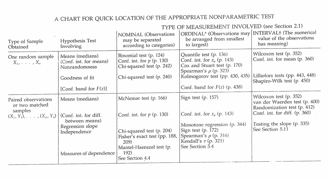
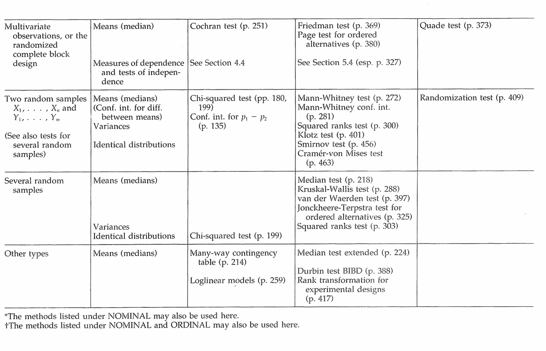
Tabel Guide Uji Nonparametrik
Uji Cramer von Mises
Lindsey, Herzberg dan Watts (1987) memberikan data lebar ruas pertama tarsus kedua untuk dua spesies serangga Chaetocnema. Apakah ini menunjukkan perbedaan populasi antara distribusi lebar untuk kedua spesies?
| Species A | 131 | 134 | 137 | 127 | 128 | 118 | 134 | 129 | 131 | 115 |
|---|---|---|---|---|---|---|---|---|---|---|
| Species B | 107 | 122 | 144 | 131 | 108 | 118 | 122 | 127 | 125 | 124 |
Tujuan: Akan dilakukan pengujian Cramer Von Mises untuk mengetahui apakah ada perbedaan distribusi antar populasi
Hipotesis:
\(H_0: F(x) = G(x)\) for all \(x\) from \(- \infty\) to \(+ \infty\)
\(H_1: F(x) \neq G(x)\) for at least one value of \(x\)
dapat digunakan fungsi cvm_test() dari library twosamples
# install.packages('twosamples')
library(twosamples)cvm_test(df$Species_A,df$Species_B)Kesimpulannya?
Uji Friedman
Untuk kelompok tujuh siswa, denyut nadi (per menit) diukur sebelum latihan (I), segera setelah latihan (II), dan 5 menit setelah latihan (III). Data diberikan pada di bawah. Gunakan uji Friedman untuk menguji perbedaan antara denyut nadi pada tiga kesempatan.
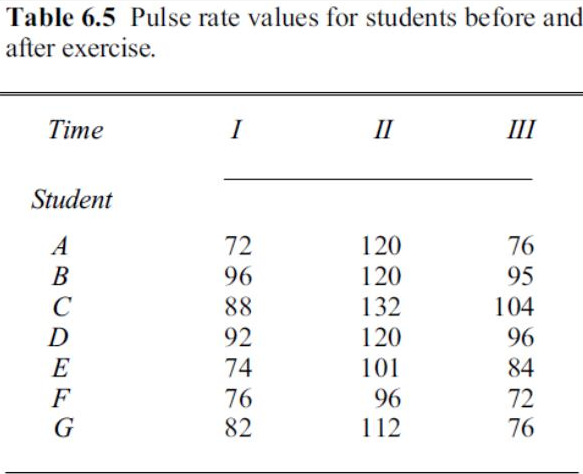
Dataset_Friedmann <- data.frame(Student = c('A','A','A','B','B','B','C','C','C','D','D','D','E','E','E','F','F','F','G','G','G'),
                                Time = rep(c(1,2,3), 7),
                                Score = c(72, 120, 76, 96, 120, 95, 88, 132, 104, 92, 120, 96, 74, 101, 84, 76, 96, 72, 82,  112, 76))
Tujuan: Akan dilakukan pengujian Friedman untuk mengetahui apakah terdapat perbedaan denyut nadi per menit pada sebelum latihan, setelah latihan, dan 5 menit setelah latihan untuk kelompok 7 siswa tersebut
Hipotesis:
\(H_0:\) All treatments have identical effects
\(H_1:\) At least one treatment yield larger observed values than at least one other treatment
dapat digunakan fungsi friedman.test() dari library stats
friedman.test(y=Dataset_Friedmann$Score, groups=Dataset_Friedmann$Time, blocks=Dataset_Friedmann$Student)Kesimpulannya?
Uji Quade
Uji Quade adalah alternatif bagi Uji Friedman. Kedua pengujian memiliki hipotesis null yang sama.
Misal ingin diuji data dari soal pada section Uji Friedmann menggunakan Uji Quade
dapat digunakan fungsi quade.test() dari library stats
quade.test(Score ~ Time | Student,
           data = Dataset_Friedmann)
Dengan menggunakan fungsi quadeAllPairsTest() dari library PMCMRplus, kita bisa melakukan Quade multiple-comparison test
# install.packages(PMCMRplus)
library(PMCMRplus)quadeAllPairsTest(y = Dataset_Friedmann$Score,
groups = Dataset_Friedmann$Time,
blocks = Dataset_Friedmann$Student,
p.adjust.method = "fdr")Hasil menunjukkan pasangan grup yang berbeda (atau tidak berbeda) secara signifikan
Uji Kruskal Wallis
Lubischew (1962) memberikan pengukuran lebar kepala maksimum dalam satuan 0,01 mm untuk tiga spesies Chaetocnema. Sebagian dari datanya diberikan di bawah ini. Gunakan uji Kruskal–Wallis untuk melihat apakah ada perbedaan lebar kepala untuk ketiga spesies Chaetocnema.
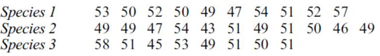
df <- data.frame (Species  = rep(c("Species_1","Species_2","Species_3"),times=c(10,11,8)),
                  lebar = c(53,50,52,50,49,47,54,51,52,57,49,49,47,54,43,51,49,51,50,46,49,58,51,45,53,49,51,50,51))
Hipotesis:
\(H_0:\) All k population distribution functions are identical
\(H_1:\) At least one population yield larger observed values than at least one other population
Atau alternatif \(H_1\) lainnya
\(H_1:\) The k populations do not all have identical means
dapat digunakan fungsi kruskal.test() dari library stats
kruskal.test(lebar ~ Species, data = df)Kesimpulannya
Correlation
Bardsley dan Chambers (1984) memiliki jumlah sapi ternak (potong) dan domba pada 19 peternakan besar di suatu wilayah. Apakah ada bukti korelasi antara sapi dan domba?
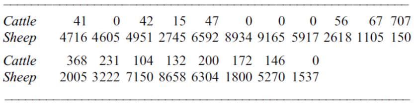
df <- data.frame (Cattle  = c(41,0,42,15,47,0,0,0,56,67,707,368,231,104,132,200,172,146,0),
                  sheep = c(4716,4605,4951,2745,6592,8934,9165,5917,2618,1105,150,2005,3222,7150,8658,6304,1800,5270,1537))
Spearman’s \(\rho\)
Uji korelasi Spearman’s \(\rho\) dapat dilakukan dengan fungsi cor.test() dari library stats dengan method "spearman"
cor.test(df$Cattle, df$sheep, method="spearman")Kendall’s \(\tau\)
Uji korelasi Kendall’s \(\tau\) dapat dilakukan dengan fungsi cor.test() dari library stats dengan method "kendall"
cor.test(df$Cattle, df$sheep, method="kendall")Regresi Nonparametrik
A driver kept track of the number of miles she traveled and the number of gallons put in the tank each time she bought gasoline.
| Miles | Gallons |
|---|---|
| 142 | 11.1 |
| 116 | 5.7 |
| 194 | 14.2 |
| 250 | 15.8 |
| 88 | 7.5 |
| 157 | 12.5 |
| 255 | 17.9 |
| 159 | 8.8 |
| 43 | 3.4 |
| 208 | 15.2 |
Miles = c(142, 116, 194, 250, 88, 157, 255, 159, 43, 208)
Gallons = c(11.1, 5.7, 14.2, 15.8, 7.5, 12.5, 17.9, 8.8, 3.4, 15.2)
df = data.frame(Gallons, Miles)
df
Library yang akan digunakan:
library(stats)
library(ggplot2)
library(ggpmisc)
A. Draw a diagram showing these points, using gallons as the x-axis
plot(Gallons, Miles, xlab = "Gallons", ylab = "Miles",
     main = "Gallons x Miles", lwd = 2)
B. Estimate a and b using the method of least squares
model1 = lm(Miles ~ Gallons, data=df)
summary(model1)
C. Plot the least squares regression line on the diagram of part A
plot(Gallons, Miles, xlab = "Gallons", ylab = "Miles",
     main = "Gallons x Miles", lwd = 2)
abline(reg = model1, col = "blue")
D. Suppose the EPA estimated this car’s mileage at 18 miles per gallon. Test the null hypothesis that this figure applies to this particular car and driver. (Use the test for slope)
\(H_0:\) Jarak tempuh mobil (\(\beta\)) adalah 18 mil/galon
\(H_1:\) Jarak tempuh mobil (\(\beta\)) bukan 18 mil/galon
results = list()
beta0 = 18

for (i in 1:length(df$Miles)) {
  results[[i]] <- df$Miles[i] - beta0 * df$Gallons[i]
}
results = unlist(results)
results

stat_uji = cor(Gallons, results, method = "spearman")
stat_uji
abs(stat_uji) > 0.6364
E. Find a 95% confidence interval for the mileage of this car and driver
# Function to calculate pairwise slopes
calculate_slopes <- function(X, Y) {
  slopes <- c()
  n <- length(X)

  for (i in 1:(n - 1)) {
    for (j in (i + 1):n) {
      if (X[j] != X[i]) {  # Avoid division by zero
        S_ij <- (Y[j] - Y[i]) / (X[j] - X[i])
        slopes <- c(slopes, S_ij)
      }
    }
  }
  return(slopes)
}

# Calculate pairwise slopes
slopes <- calculate_slopes(df$Gallons, df$Miles)

# Median slope (Theil-Sen estimator)
median_slope <- median(slopes)

# 95% confidence interval
lower_bound <- quantile(slopes, 0.025)  # 2.5th percentile
upper_bound <- quantile(slopes, 0.975)  # 97.5th percentile

# Output results
list(
  median_slope = median_slope,
  lower_bound = lower_bound,
  upper_bound = upper_bound
)
TipModel Alternatif
# Median slope (Theil-Sen estimator)
median_slope <- median(slopes)
Pada metode kalkulasi confidence interval di atas dapat digunakan untuk membentuk suatu estimasi persamaan regresi nonparametrik dengan median Y dan X sebagai estimator intercept dan \(\beta\) secara berturut-turut.
Regresi Monotonik
Metode regresi linier nonparametrik dapat digunakan ketika asumsi regresi linier dapat dipenuhi. Dalam situasi dimana tidak dapat diasumsikan bahwa garis regresi adalah linier tapi dapat diasumsikan bahwa E(Y|X) naik (minimal tidak turun) dengan meningkatnya X. Dalam hal ini dinamakan regresinya naik secara monoton.
| Xi | Yi |
|---|---|
| 0.0 | 30 |
| 0.5 | 30 |
| 1.0 | 30 |
| 1.8 | 28 |
| 2.2 | 24 |
| 2.7 | 19 |
| 4.0 | 17 |
| 4.0 | 9 |
| 4.9 | 12 |
| 5.6 | 12 |
| 6.0 | 6 |
| 6.5 | 8 |
| 7.3 | 4 |
| 8.0 | 5 |
| 8.8 | 6 |
| 9.3 | 4 |
| 9.8 | 6 |
# Data extracted from the table
data <- data.frame(
  Xi = c(0, 0.5, 1.0, 1.8, 2.2, 2.7, 4.0, 4.0, 4.9, 5.6, 6.0, 6.5, 7.3, 8.0, 8.8, 9.3, 9.8),
  Yi = c(30, 30, 30, 28, 24, 19, 17, 9, 12, 12, 6, 8, 4, 5, 6, 4, 6)
)

data$R_Xi <- rank(data$Xi, ties.method = "average")
data$R_Yi <- rank(data$Yi, ties.method = "average")

n <- nrow(data)
mean_R_Xi <- mean(data$R_Xi)
mean_R_Yi <- mean(data$R_Yi)

# Calculate b2 (slope)
b2 <- sum((data$R_Xi - mean_R_Xi) * (data$R_Yi - mean_R_Yi)) /
      sum((data$R_Xi - mean_R_Xi)^2)

# Calculate a2 (intercept)
a2 <- mean_R_Yi - b2 * mean_R_Xi

# Estimate R(Y) for Given R(X)
data$Rhat_Yi <- a2 + b2 * data$R_Xi

# Convert Rhat_Y back to Y
interpolate_Y <- function(R_hat_Y, Yi, R_Yi) {
  if (R_hat_Y %in% R_Yi) {
    return(Yi[which(R_Yi == R_hat_Y)])  # Return the Yi if the rank is equal
  } else if (R_hat_Y < min(R_Yi)) {
    return(min(Yi))  # Return the largest Yi if the rank is less than the minimum
  } else if (R_hat_Y > max(R_Yi)) {
    return(max(Yi))  # Return the largest Yi if the rank is greater than the maximum
  } else {
    # Find the nearest ranks for interpolation
    lower <- max(R_Yi[which(R_Yi < R_hat_Y)])
    upper <- min(R_Yi[which(R_Yi > R_hat_Y)])

    Y_lower <- Yi[which(R_Yi == lower)]
    Y_lower <- Y_lower[1]
    Y_upper <- Yi[which(R_Yi == upper)]
    Y_upper <- Y_upper[1]
    R_lower <- lower
    R_upper <- upper

    # Linear interpolation
    return(Y_lower + (R_hat_Y - R_lower) / (R_upper - R_lower) * (Y_upper - Y_lower))
  }
}

data$Yhat_i <- sapply(data$Rhat_Yi, interpolate_Y, Yi = data$Yi, R_Yi = data$R_Yi)

data$Rhat_Xi <- (data$R_Yi - a2)/b2

interpolate_X <- function(R_hat_X, X, R_X) {
  if (R_hat_X <= min(R_X)) {
    return(NULL)
  }
  if (R_hat_X >= max(R_X)) {
    return(NULL)
  }

  # Find the nearest ranks for interpolation
  lower <- max(which(R_X <= R_hat_X))
  upper <- min(which(R_X > R_hat_X))

  X_lower <- X[lower]
  X_upper <- X[upper]
  R_lower <- R_X[lower]
  R_upper <- R_X[upper]

  # Linear interpolation
  return(X_lower + (R_hat_X - R_lower) / (R_upper - R_lower) * (X_upper - X_lower))
}

data$Xhat_i <- sapply(data$Rhat_Xi, function(R_hat) interpolate_X(R_hat, data$Xi, data$R_Xi))
data
Now we can visualize the results
data_clean <- data[!sapply(data$Xhat_i, is.null), ]

combined <- rbind(
  as.matrix(data[, c('Xhat_i', 'Yi')]),
  as.matrix(data[, c('Xi', 'Yhat_i')])
)

combined <- as.data.frame(combined)
colnames(combined) <- c('X', 'Y')
combined <- combined[!sapply(combined$X, is.null), ]
combined$X <- unlist(combined$X)
combined$Y <- unlist(combined$Y)
combined <- combined[order(combined$X), ]
combined

# Scatter plot of original data
plot(data$Xi, data$Yi, pch = 16, col = "blue", xlab = "Xi", ylab = "Yi",
     main = "Monotonic Regression")

lines(combined$X, combined$Y, type = "b", col = "red", pch = 19, lwd = 2)

# Add a legend
legend("topright", legend = c("Original Data", "Fitted Curve"), col = c("blue", "red"), pch = c(16, NA), lty = c(NA, 1))
Kernel Smoothing
#Contoh 1 ---
##Library for plots
library(ggplot2)
library(ggpubr)
##Entering data and making data in approprite form to do analysis
x <- c(11, 22, 33, 44, 50, 56, 67, 70, 78, 89, 90, 100)
y <- c(2337, 2750, 2301, 2500, 1700, 2100, 1100, 1750, 1000, 1642, 2000, 1932)
df <- data.frame(x, y)
## Nadaraya-Watson bandwiths
plot(df$x, df$y, type = "l")
kernsmooth5 <- ksmooth(df$x, df$y, kernel="normal", bandwidth=5)
lines(kernsmooth5, lwd=2, col='blue')
kernsmooth10 <- ksmooth(df$x, df$y, kernel="normal", bandwidth=10)
lines(kernsmooth10, lwd=2, col='red')
legend("topleft",
legend = c("b = 5", "b = 10"),
col = c("blue", "red"),
lty = 1,
cex = 0.6)
##Defining both gaussian and epanechinkov kernel functions
gaussian_ker <- function(x){
val = (1/sqrt(2*pi))*exp(-0.5*x^2)
return(val)
}
epanech_ker <- function(x){
ind1 = ifelse((-1 <= x & x<= 1),1,0)
val = (3/4)*(1-x^2)*ind1
return(val)
}
##defining bandwidth
h = 10
##fitting
fitted_gaussian <- c()
fitted_epan <- c()
##For loop to find fitted value for both kernel functions
for (i in 1:nrow(df)) {
x_temp <- df$x[i]
temp_denominator_gauss <- 0
temp_denominator_epan <- 0
temp_num_gauss <- 0
temp_num_epan <- 0
for (k in 1:nrow(df)) {
temp_denominator_gauss = temp_denominator_gauss + gaussian_ker((x_temp - df$x[k])/h)
temp_denominator_epan = temp_denominator_epan + epanech_ker((x_temp - df$x[k])/h)
temp_num_gauss = temp_num_gauss + gaussian_ker((x_temp - df$x[k])/h)*df$y[k]
temp_num_epan = temp_num_epan + epanech_ker((x_temp - df$x[k])/h)*df$y[k]
}
fitted_gaussian[i] = temp_num_gauss/temp_denominator_gauss
fitted_epan[i] = temp_num_epan/temp_denominator_epan
}
fitted_kern <- ksmooth(df$x, df$y, kernel="normal", bandwidth=h, n.points = nrow(df))
fitted_kern <- as.data.frame(fitted_kern)$y
df$fitted_gaussian <- fitted_gaussian
df$fitted_epan <- fitted_epan
df$fitted_nadaraya <- fitted_kern
##Data frame for all fitted values is given as:
df
##For plotting
p1 <- ggplot(df, aes(x = x, y = fitted_gaussian)) + geom_point() +
geom_point(aes(y = y), col = "red")+ geom_line()
p2 <- ggplot(df, aes(x = x, y = fitted_epan)) + geom_point() +
geom_point(aes(y = y), col = "red") + geom_line()
p3 <- ggplot(df, aes(x = x, y = fitted_nadaraya)) + geom_point() +
geom_point(aes(y = y), col = "red") + geom_line()
ggarrange(p1, p2, p3, labels = c("Gaussian", "Epanechnikov", "Nadaraya-Watson"), nrow = 1, ncol = 3)Regresi Spline
library(splines)#Spline regression
Day = c(5,10,25,45,70,85,90,100,110,125,130,150,175)
Sales = c(100,125,250,300,350,460,510,460,430,400,370,340,330)
data = data.frame(Day,Sales)
ggplot(data, aes(x=Day, y = Sales)) + geom_point()
model_linear = lm(Sales ~Day, data = data)
summary(model_linear)
plot(Sales~Day)
lines(data$Day, predict(model_linear), col="red")
data
#Model Spline
model_spline = lm(Sales ~ bs(Day, knots = c(10, 25, 70, 90,100,150)))
summary(model_spline)
plot(Sales ~ Day)
lines(data$Day, predict(model_spline), col = "red")
quantile(Day, 0.2) #20%
quantile(Day, 0.4) #40%
quantile(Day, 0.6) #60%
quantile(Day, 0.8) #80%
model_quantile = lm(Sales ~ bs(Day, knots = c(33,82,102,128)))
summary(model_quantile)
plot(model_quantile)